Project Overview
The Baked Bear is a San Diego based ice cream sandwich franchise. Their site offers information about their menu, their locations, and has a pickup/delivery feature. There are multiple opportunities for improvement of the user experience.
Goal
Conduct user testing to determine problems with the user experience. Determine solutions to these problems and redesign the site to implement these solutions.
Design Process
1 - Research
2 - Problems and Solutions
3 - Design
4 - Final Design
1 - Research
User Testing
I conducted user testing of The Baked Bear site by asking users to complete the following tasks: browse the menu and create an ice cream sandwich, find their nearest location, and place an order for pickup/delivery.
Each user was asked to voice their thoughts out loud as they completed the tasks. Based on this testing and my own analysis of the site, I discovered four areas of opportunity to focus on:
1. Font: The font used throughout the site, Amatic SC (small caps), can be difficult to read under even ideal situations. Better readability is achieved by increased shape contrast of the characters, which comes from having a mixed-case font.
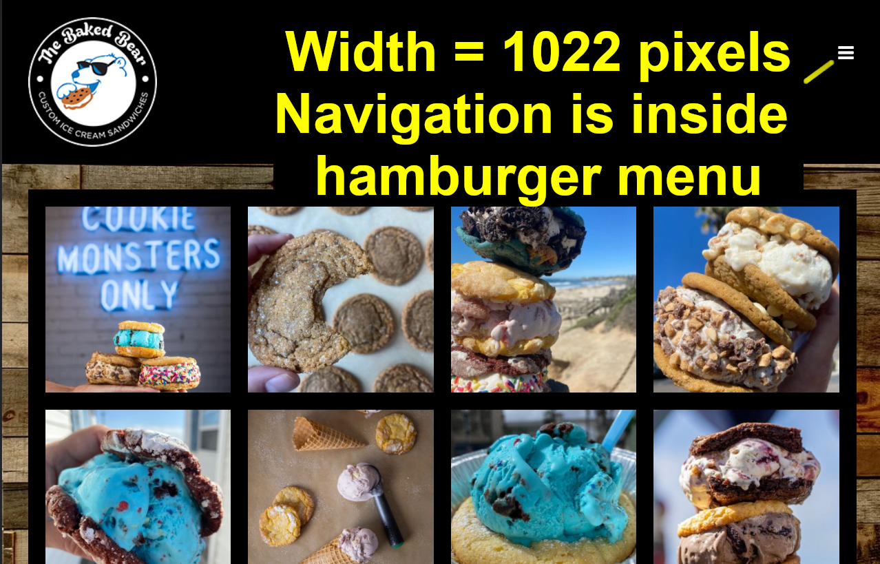
2. Responsive design: The site doesn't contain any visible navigation on a mobile device. All navigation is hidden behind a hamburger menu. This puts the most critical links an additional step away from the user. This is a violation of Fitts's Law as the target (navigation menu) is hidden and leads to more time for the user to complete their task.
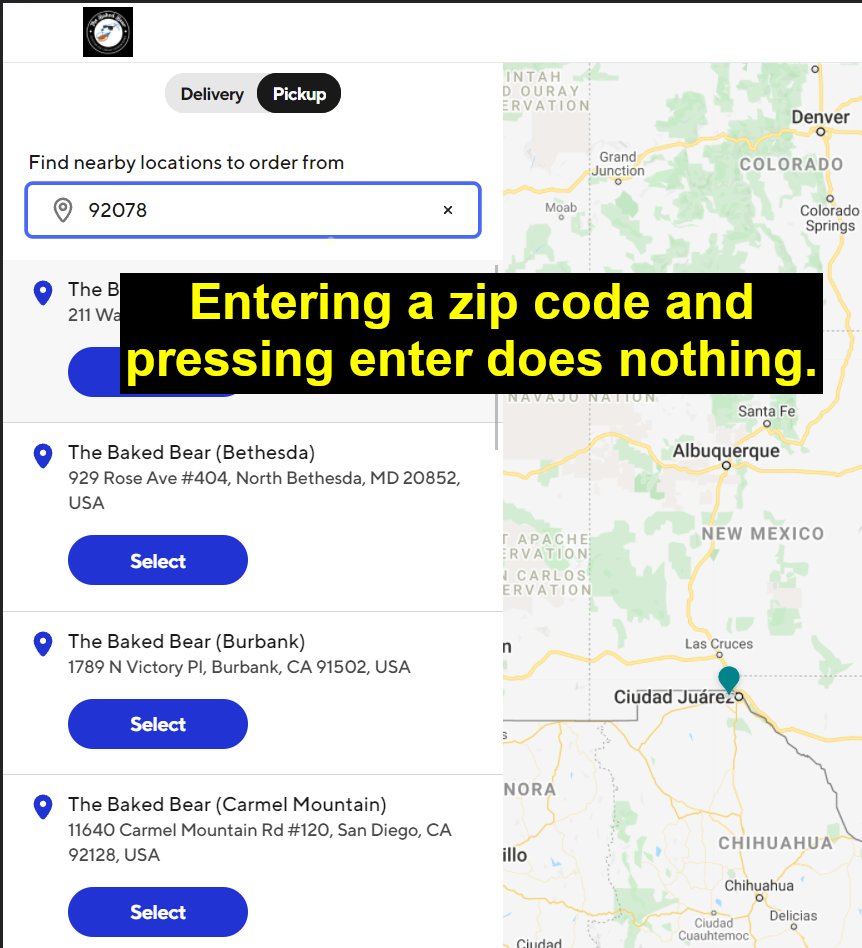
3. Online pickup/delivery location search: Online pickup/delivery redirects to a different site with a different format. Feedback from user testing was critical of this as it was jarring and unexpected. The search field also didn't function properly.
4. Menu lacks a call to action: The menu section lists the steps and ingredients to build your ice cream sandwich. However, there is no call to action or link to the online ordering page.
Case Study
The purpose of the study is to analyze how effectively The Bake Bear promotes their brand and their online pickup and delivery system. The site has two primary tasks: to educate users about the restaurant's offerings, and to facilitate ordering for pickup or delivery.
2 - Problems and Solutions
Problem 1: Mobile responsiveness
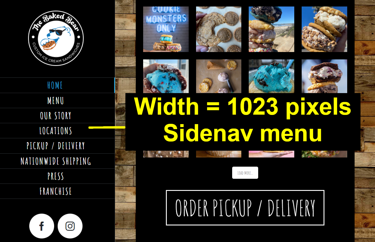
The home page contains a side navigation bar when the browser has a width greater than 1022 pixels. Once it drops to 1022 pixels or less, all navigation links are hidden behind a small hamburger menu. This is not an effective use of space, especially on mobile devices and tablets. Putting critical navigation an additional step away from the user makes tasks take longer to complete. This violates Fitts's Law: the time to acquire a target is a function of the distance to and size of the target.

Solution 1
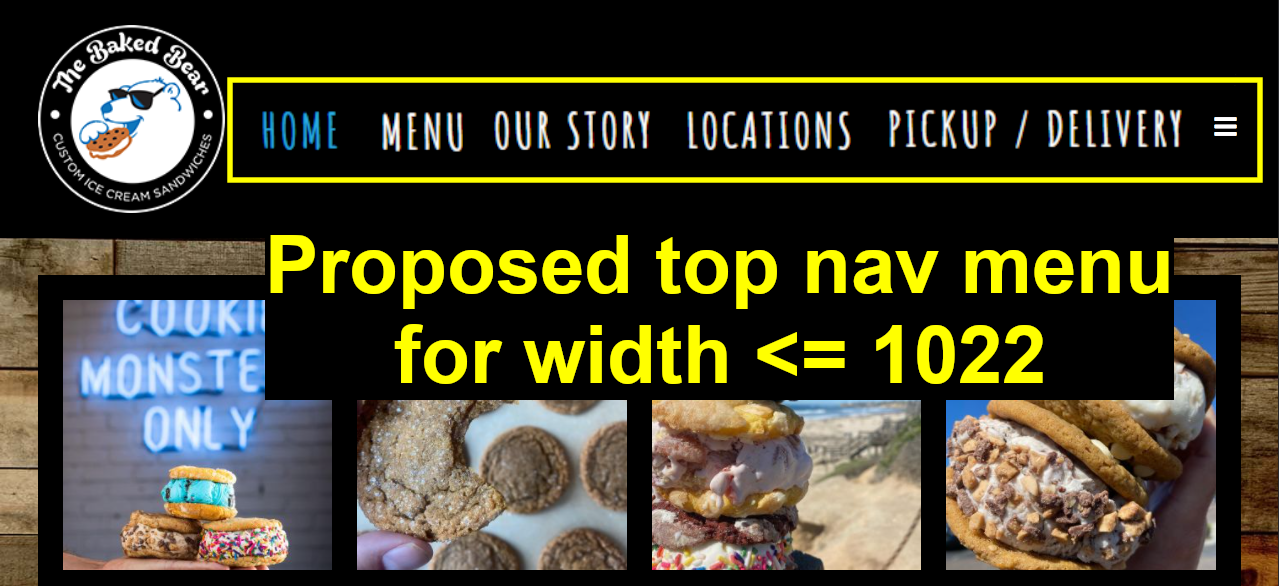
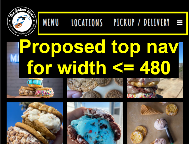
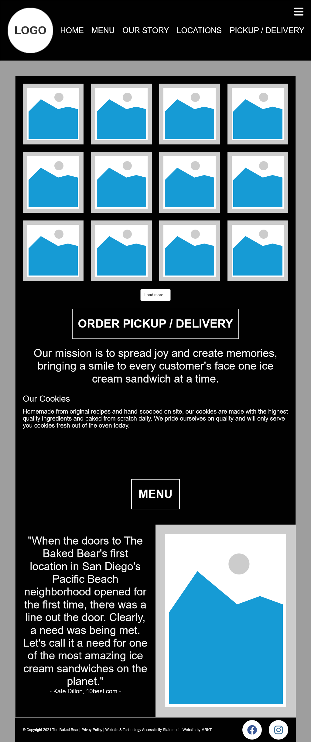
Shifting the sidenav to the top of the page when the screen width is 1022 pixels or less makes use of the space. Some of the less important navigation options can be hidden behind a hamburger menu. The menu options will change again once the screen width drops to 480 pixels or less.
Problem 2: Online pickup/delivery issues
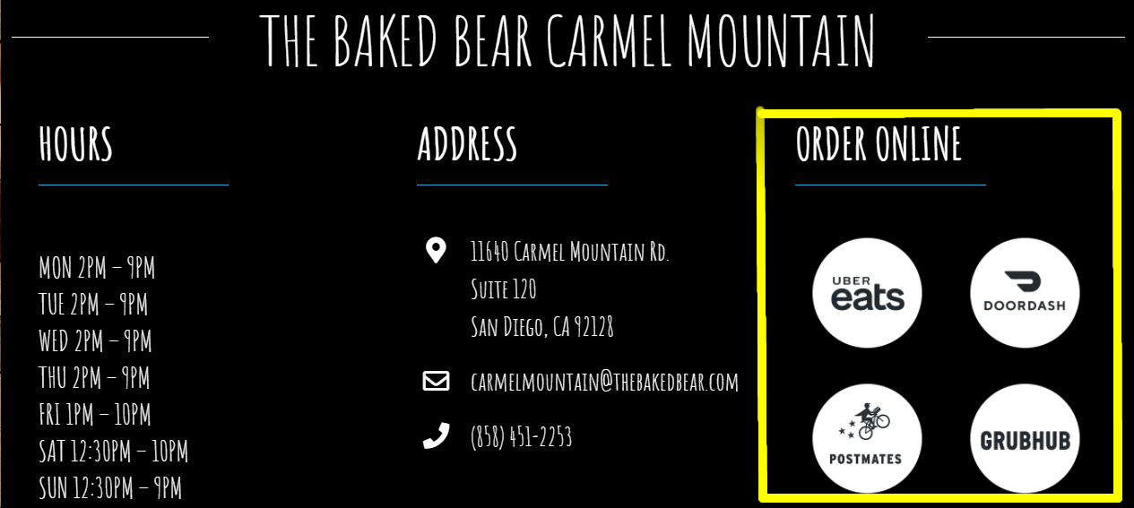
Clicking the Pickup/Delivery link redirects the user to DoorDash without warning. Some of the franchise locations offer other delivery services such as Uber Eats, Grubhub, Postmates, etc. as well. If a user has a paid unlimited delivery membership for a delivery service other than DoorDash they can't take advantage of it using this link.
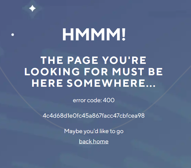
The user is asked to input an address, zipcode, or city. Entering a zip code and pressing enter doesn't work. Entering an address gives an error page from DoorDash. These errors can easily and quickly lead to user frustration and abandonment of the site.
Solution 2
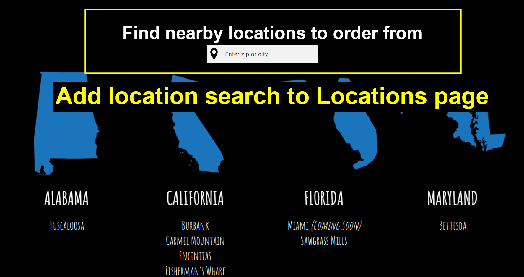
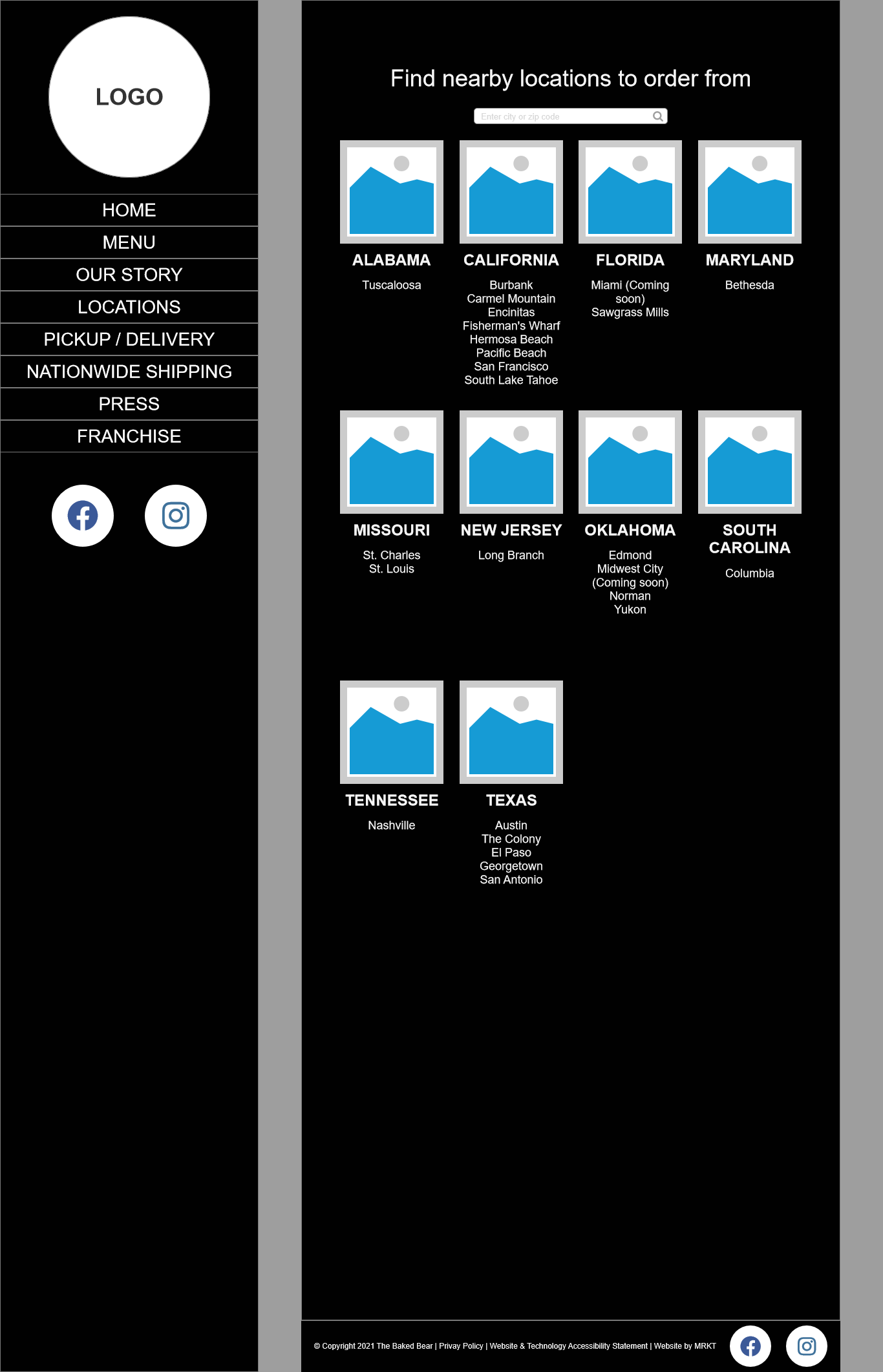
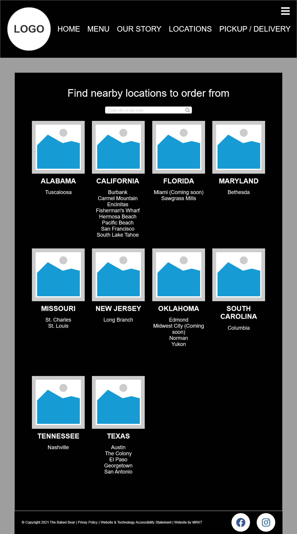
Route Pickup/Delivery traffic through the restaurant locator on The Baked Bear site first. Add a location finder search box on the Locations page. Each location already lists the delivery services they offer. Add links to each delivery service icon to direct the user to the appropriate delivery service. This gives the user the power of choice and eliminates the frustrating DoorDash search issues.
Problem 3: The menu lacks a call to action
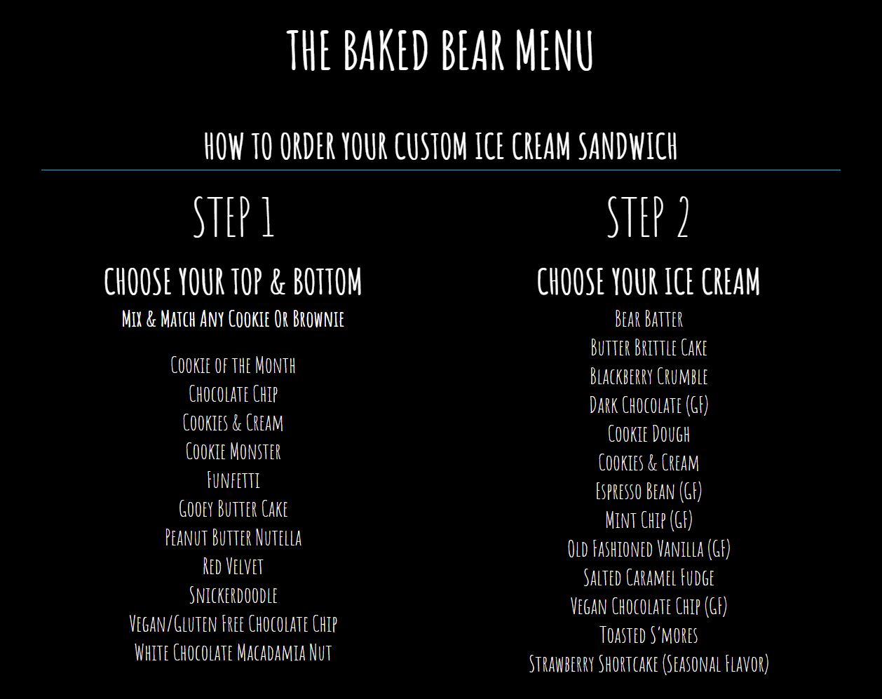
There is currently no call to action on the menu page. After reading through the ingredients and creation process, if a user wants to place an order, they must go to a separate page. The user may not even realize that pickup and delivery are an option. The current menu is a dead end for the user.
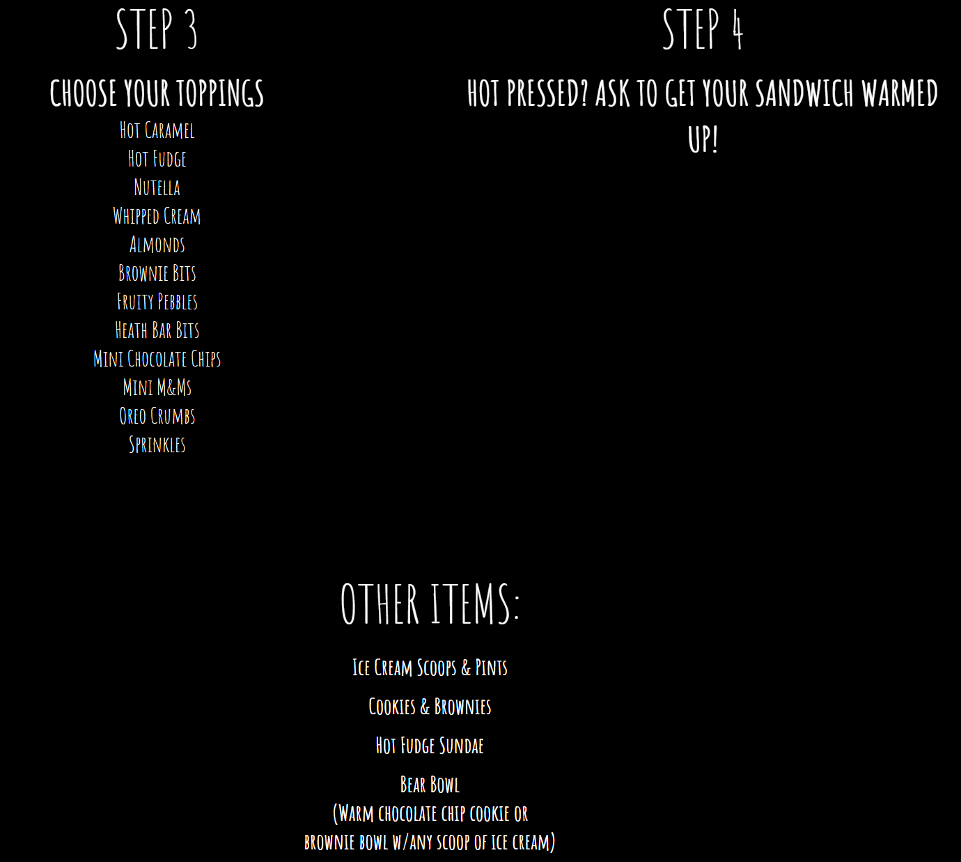
Solution 3
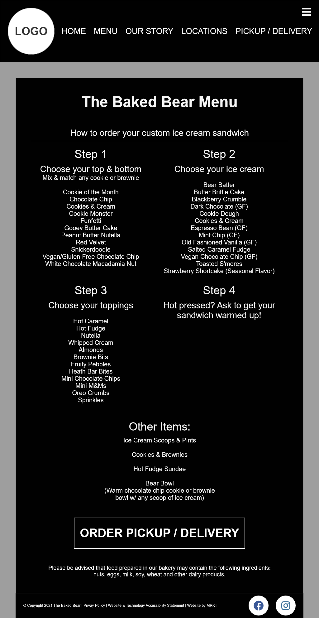
Add a call to action button to the menu page allowing users to place an order for delivery or pickup. The button will link to the Locations page as mentioned in Problem 2 and allow the user to find their nearest location and go through the pickup/delivery process.
3 - Design
Wireframe
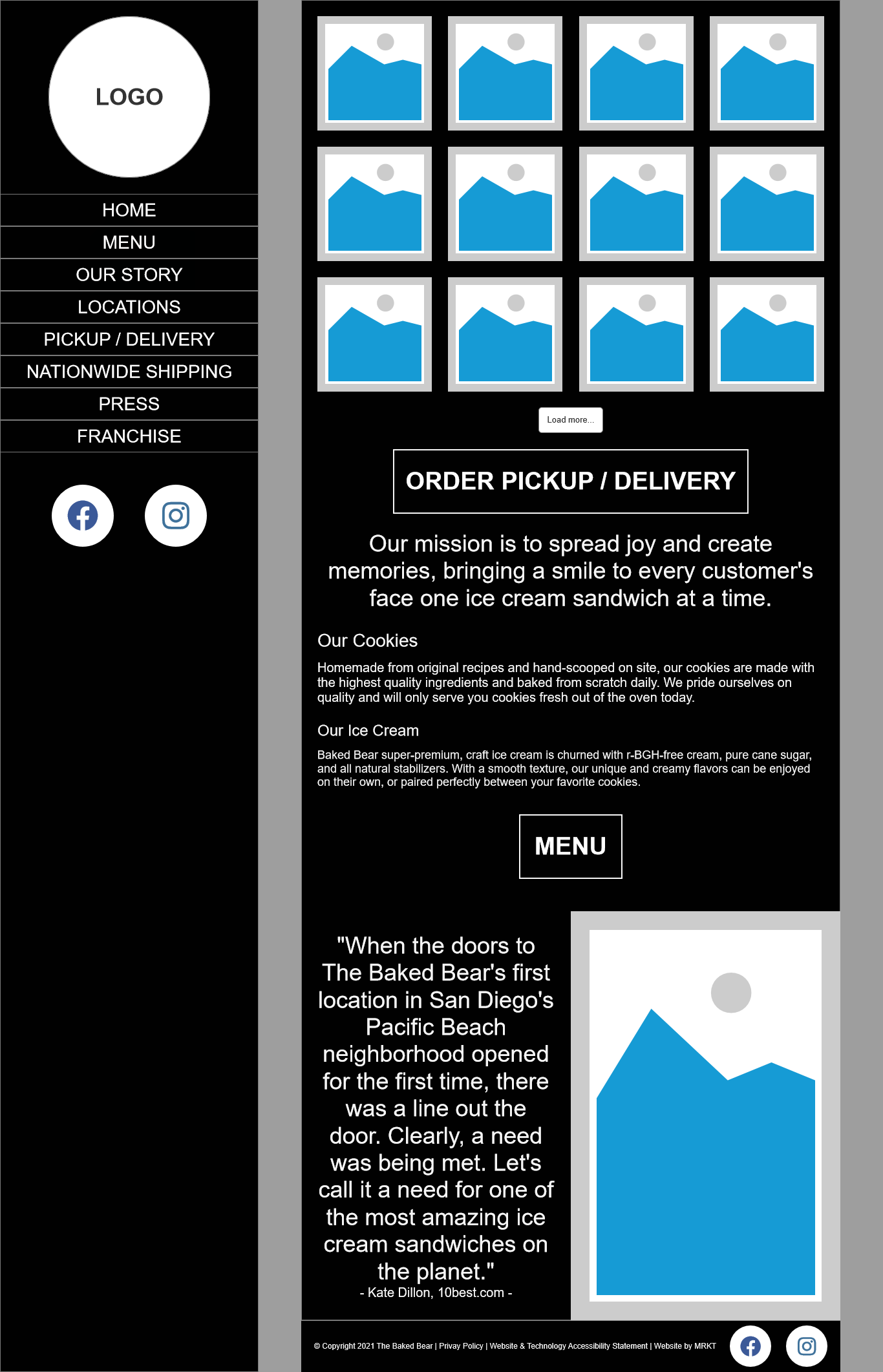
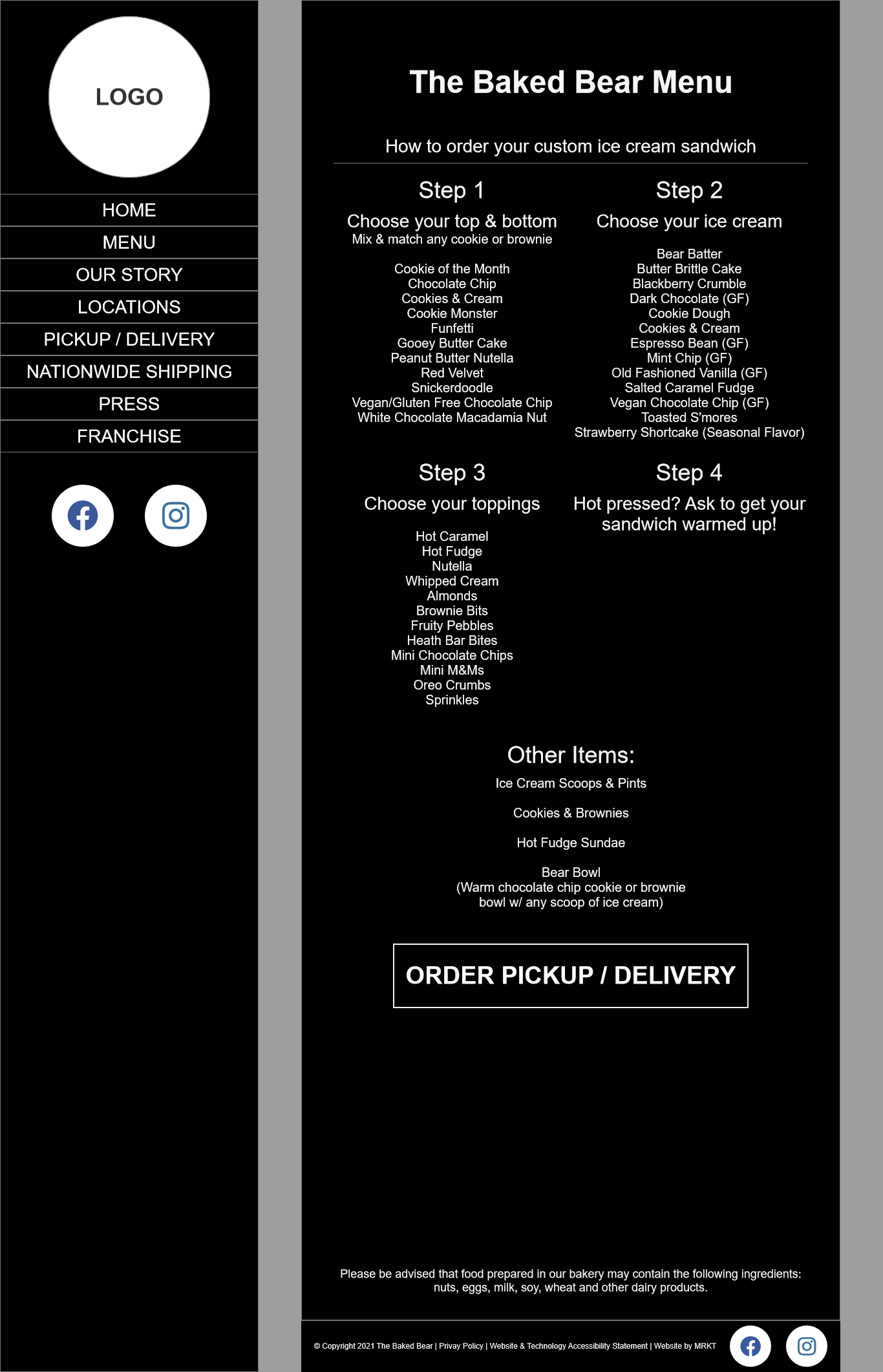
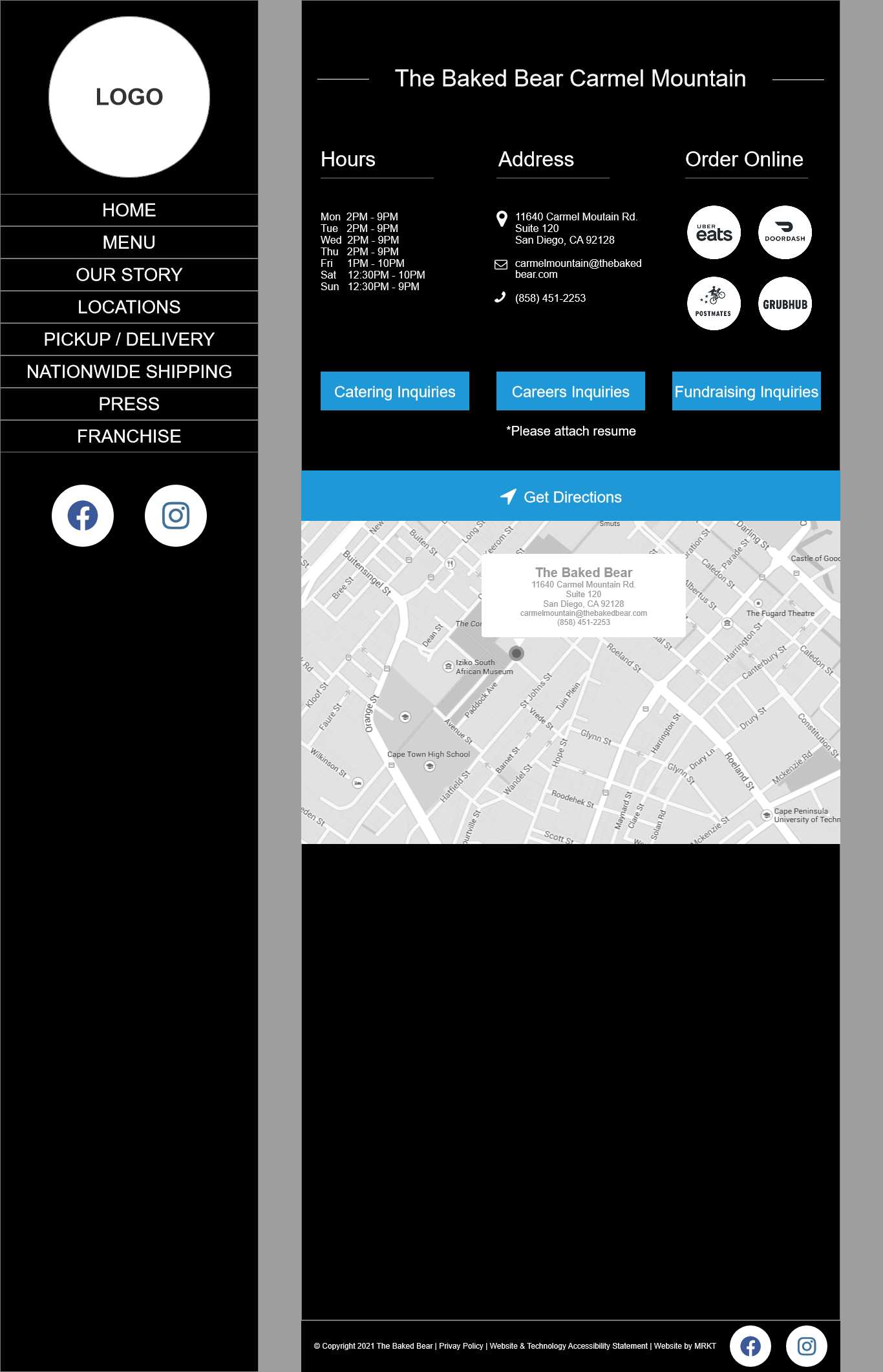
Using the visual mockups created in the case study, I designed wireframes incorporating each of the proposed solutions. This a responsive design, so there are wireframes for desktop, tablet, and mobile devices.
Desktop Wireframes
Tablet Wireframes
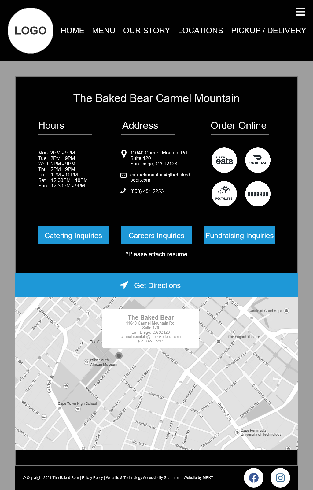
Mobile Wireframes


4 - Final Design
After building the wireframe using the solutions outlined above, I incorporated the existing color scheme and imagery from the current The Baked Bear site. The aesthetics were left largely untouched with the exception of the font. I changed it to Lato, since it's sans-serif and much easier to read across all screens.
This redesign solved the following problems:
1. Lack of mobile responsiveness: This was resolved by shifting the side navigation menu to a top navigation menu on screen widths less than 1023 pixels. Some of the less important links were hidden behind a hamburger menu as the screen gets smaller.
2. Issues with the online pickup/delivery solution: This was resolved by redirecting the pickup/delivery button to the locations page. This allows the user to choose their preferred delivery service and removed the error-prone DoorDash location search page.
3. Lack of a call to action on the menu page: This was resolved by placing a pickup/delivery order button at the bottom of the menu page. The user is now able to directly place an order after reading the menu.
The site now has a more intuitive navigational flow, better use of screen real estate across all screen sizes, provides the user more power to make decisions, and has better readability. See below for a comparison between the original and my redesign.
Original Site
Redesigned Site
Original Site
Redesigned Site
Original Site
Redesigned Site

