Overview
Design an ecommerce site for a fictional client. Digital content creator, halo_naught, wants to increase his following on other platforms and add an additional revenue stream by selling merchandise on his own site.
Goal
Design a familiar ecommerce experience fitting the client's aesthetic. Grow brand awareness and create a fun experience.
Design Process
1 - Research
2 - Design
3 - User Testing
4 - Final Design
1 - Research
Research on similar sites was conducted to determine which elements were essential to the ecommerce experience. These elements were then incorporated into the design.
Style Guide
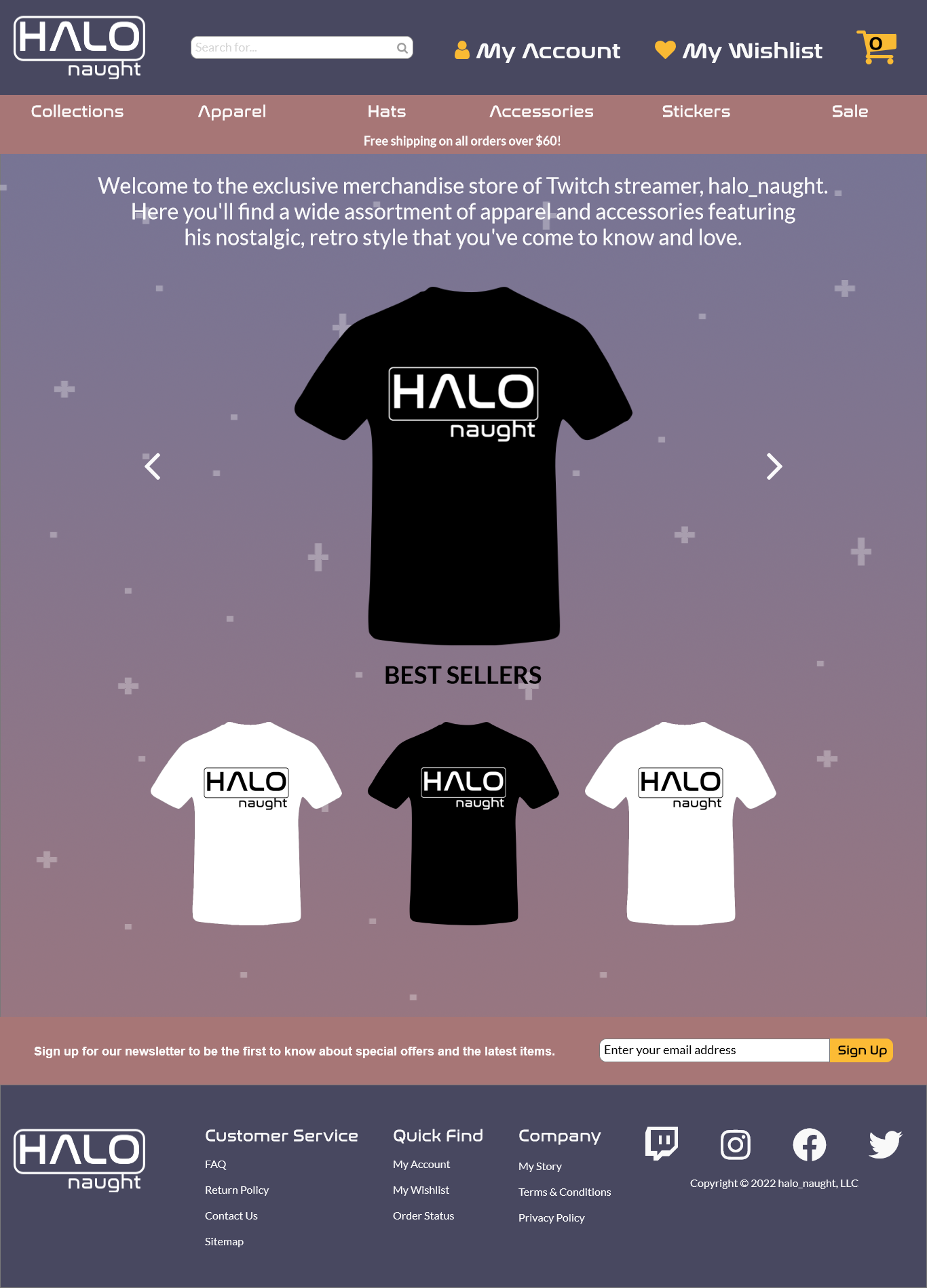
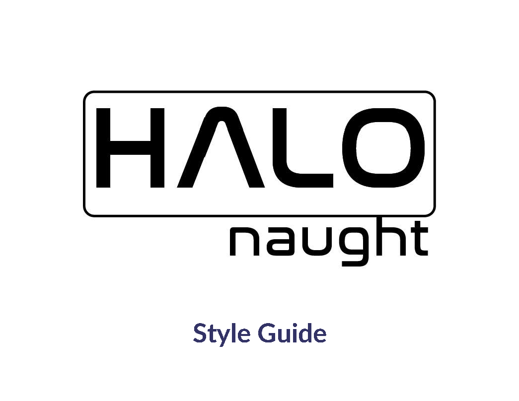
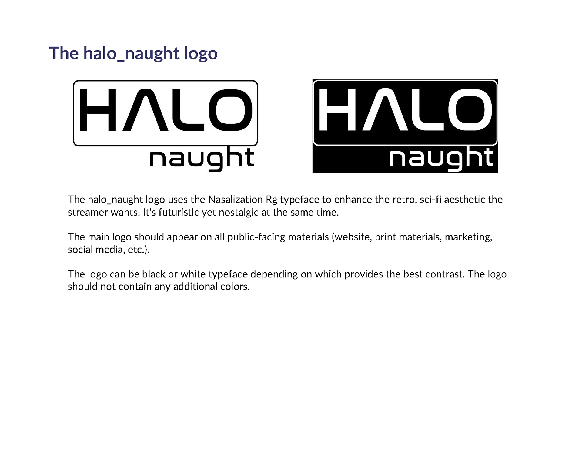
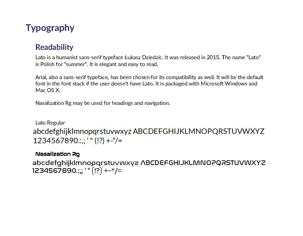
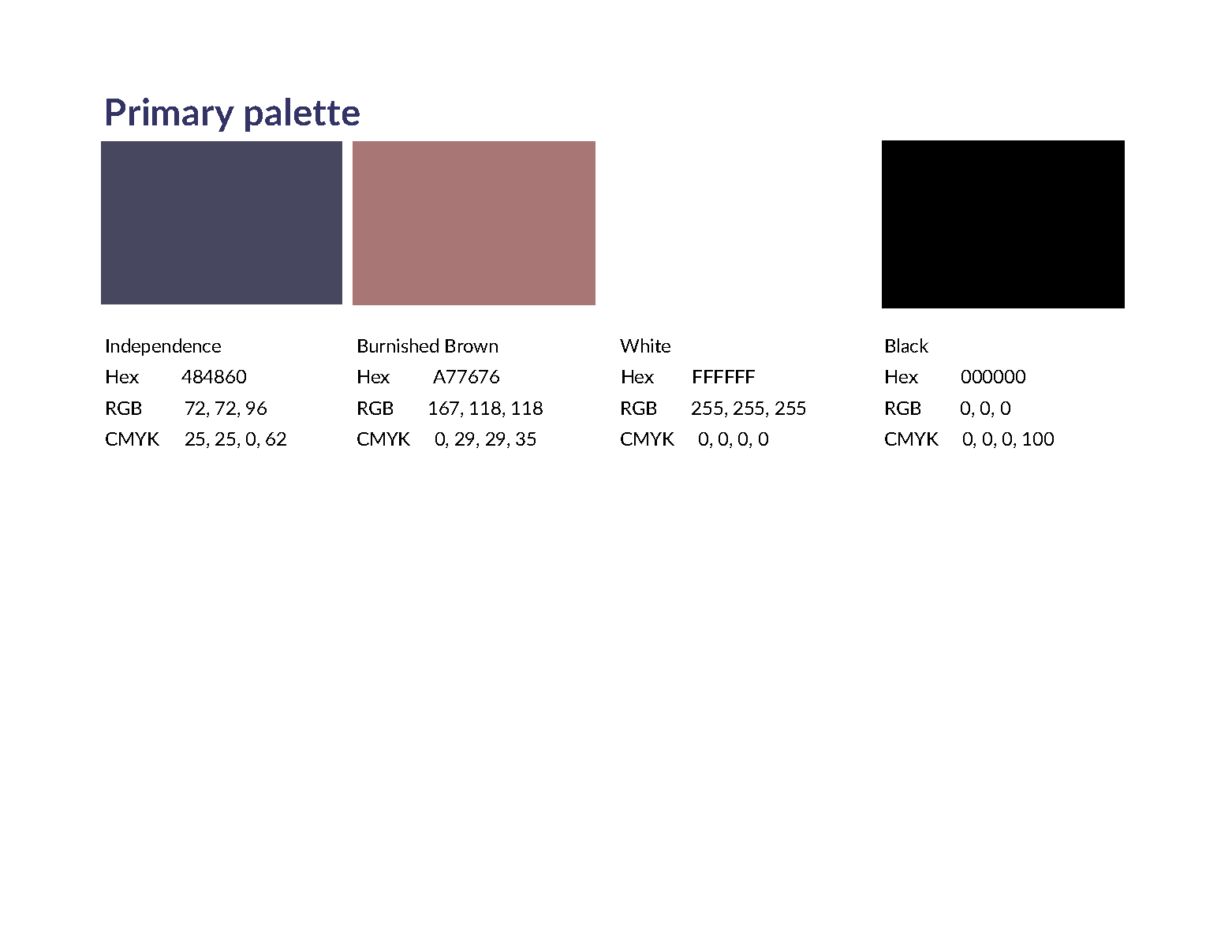
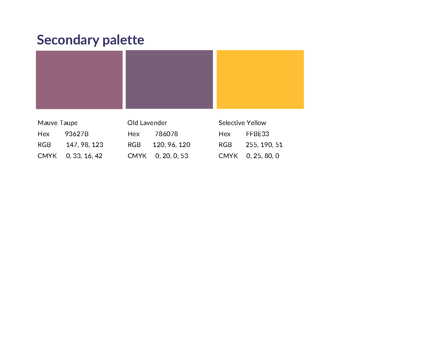
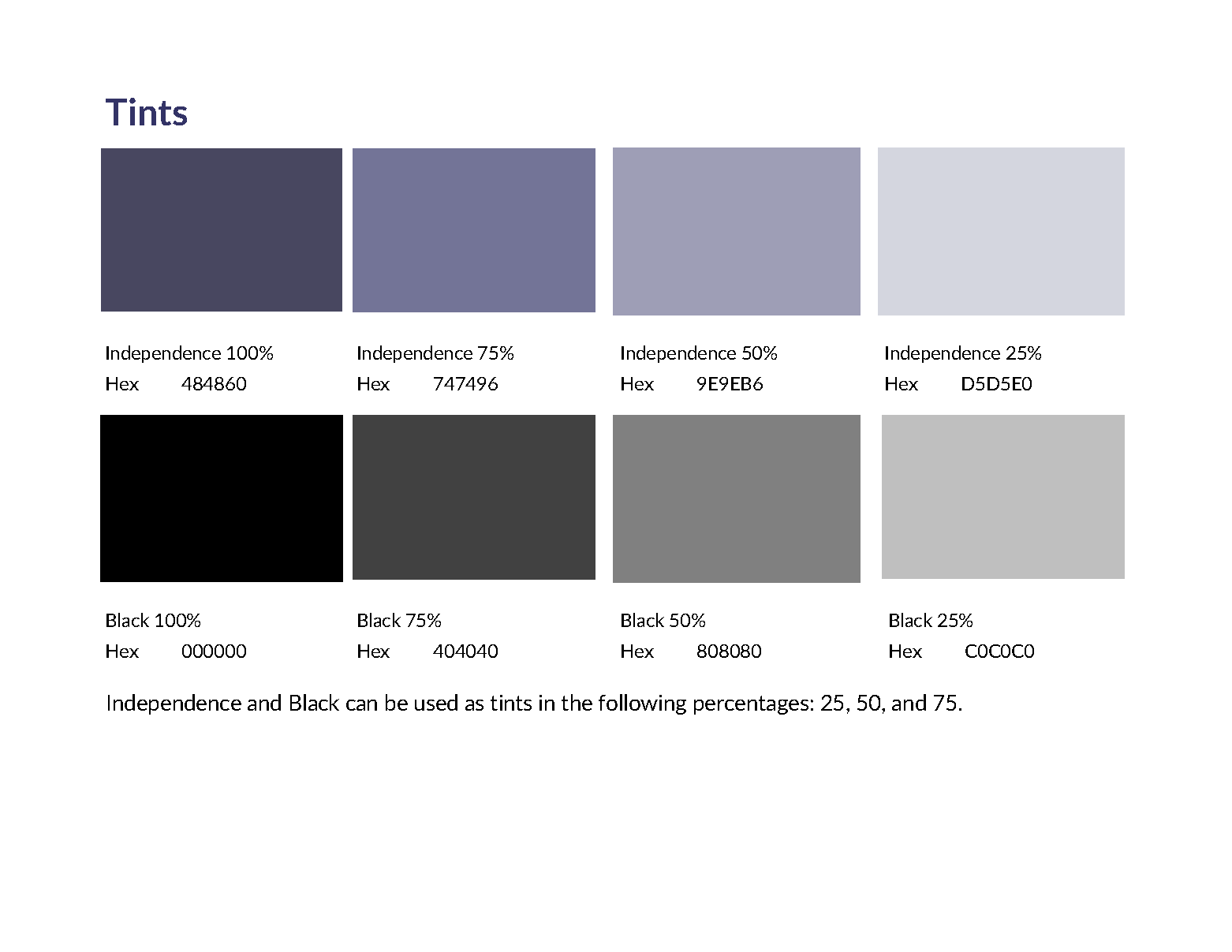
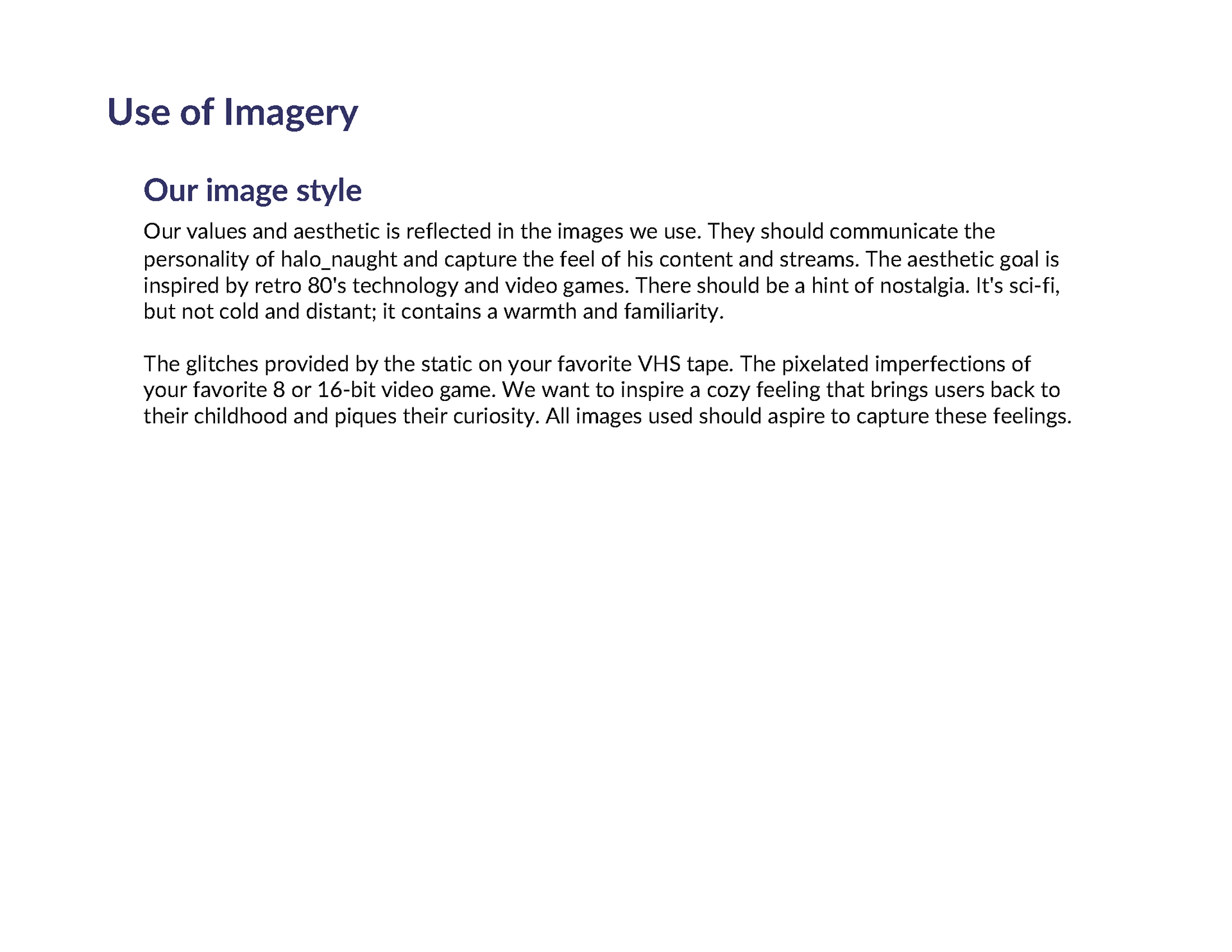
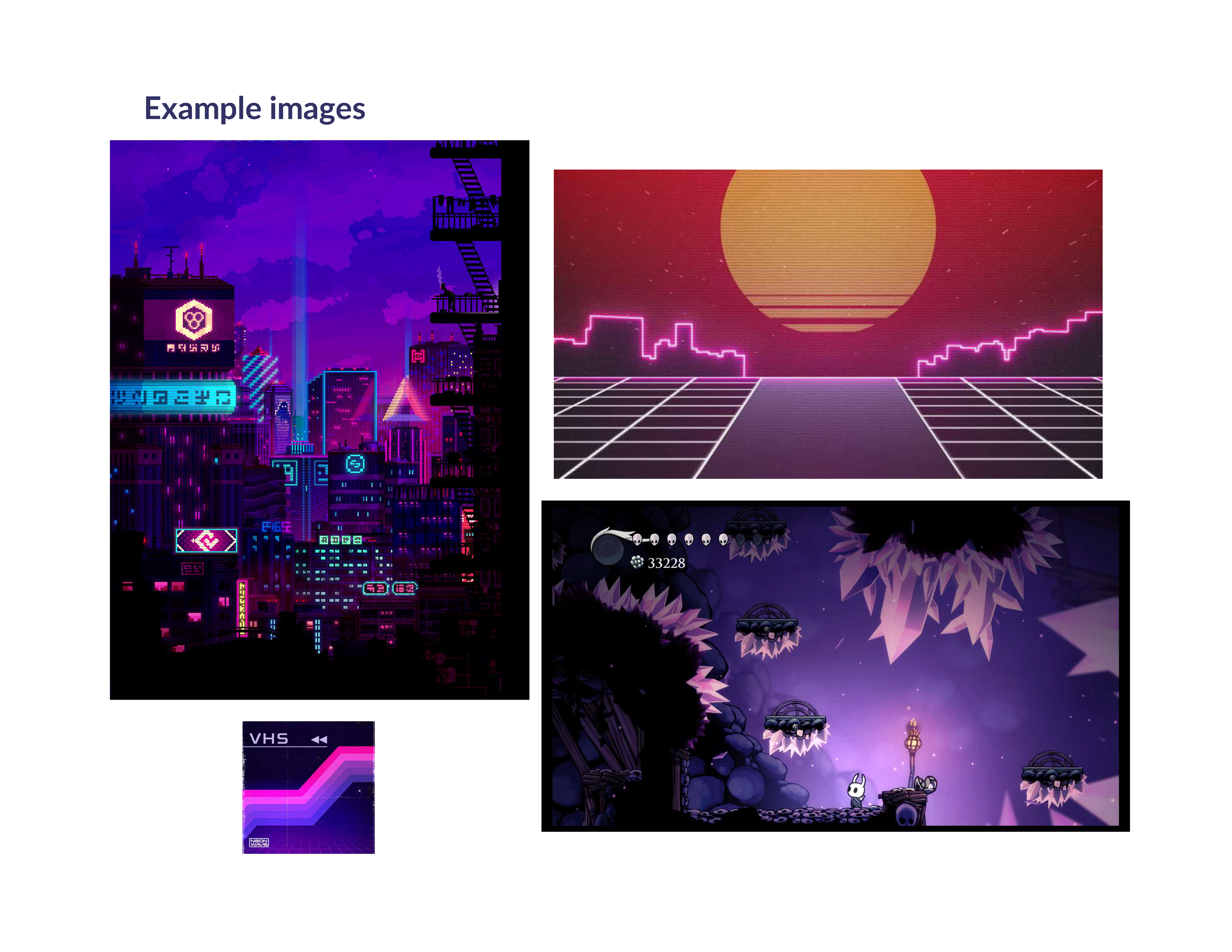
Halo_naught has a specific aesthetic which can best be described as retro video games/technology with a side of warm nostalgia. This style guide was designed with that in mind from the logo to the typography to the color palette. The color palette was chosen to bring back memories of old school, 8-bit games from our childhood.
2 - Design
Wireframe
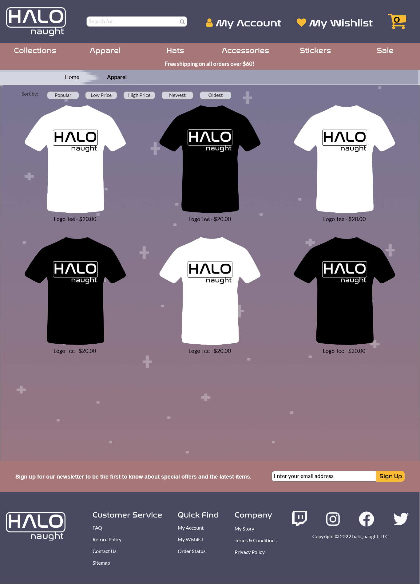
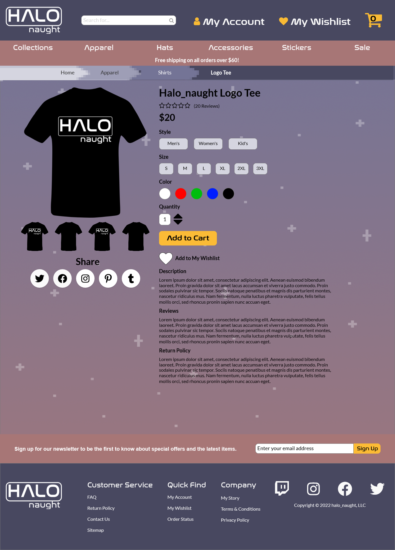
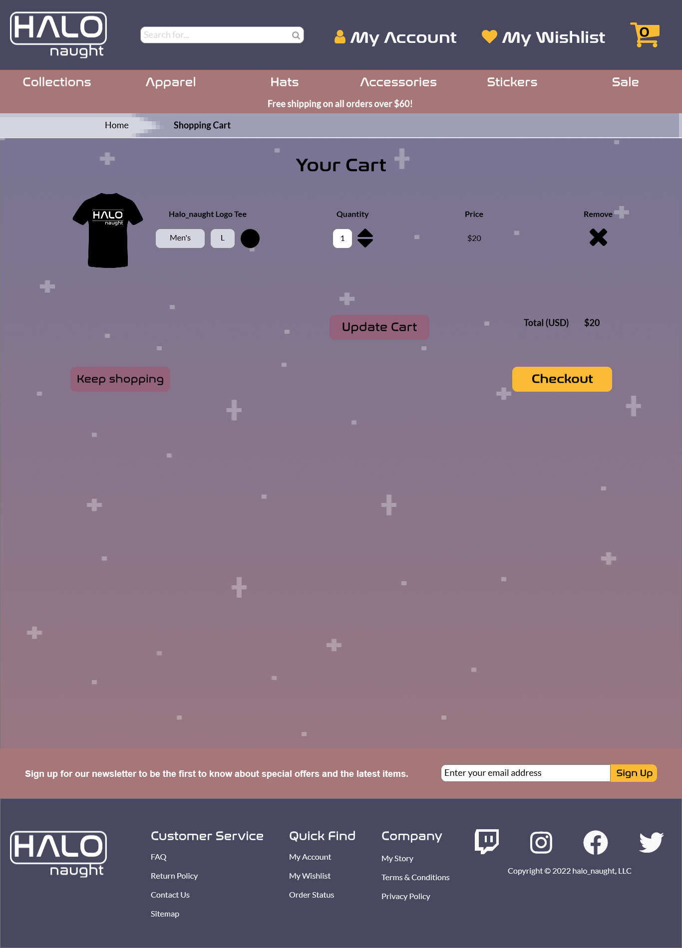
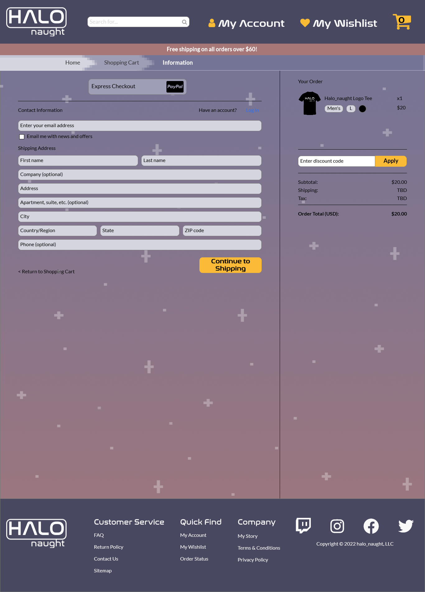
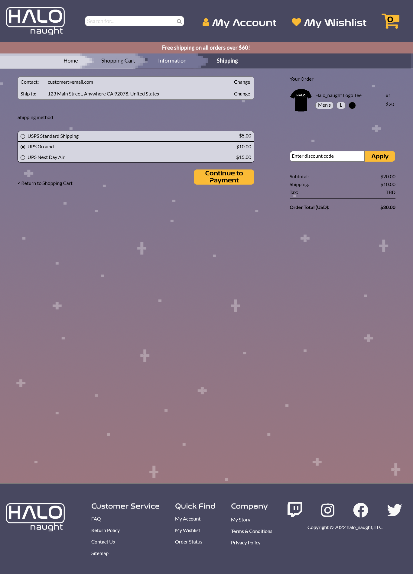
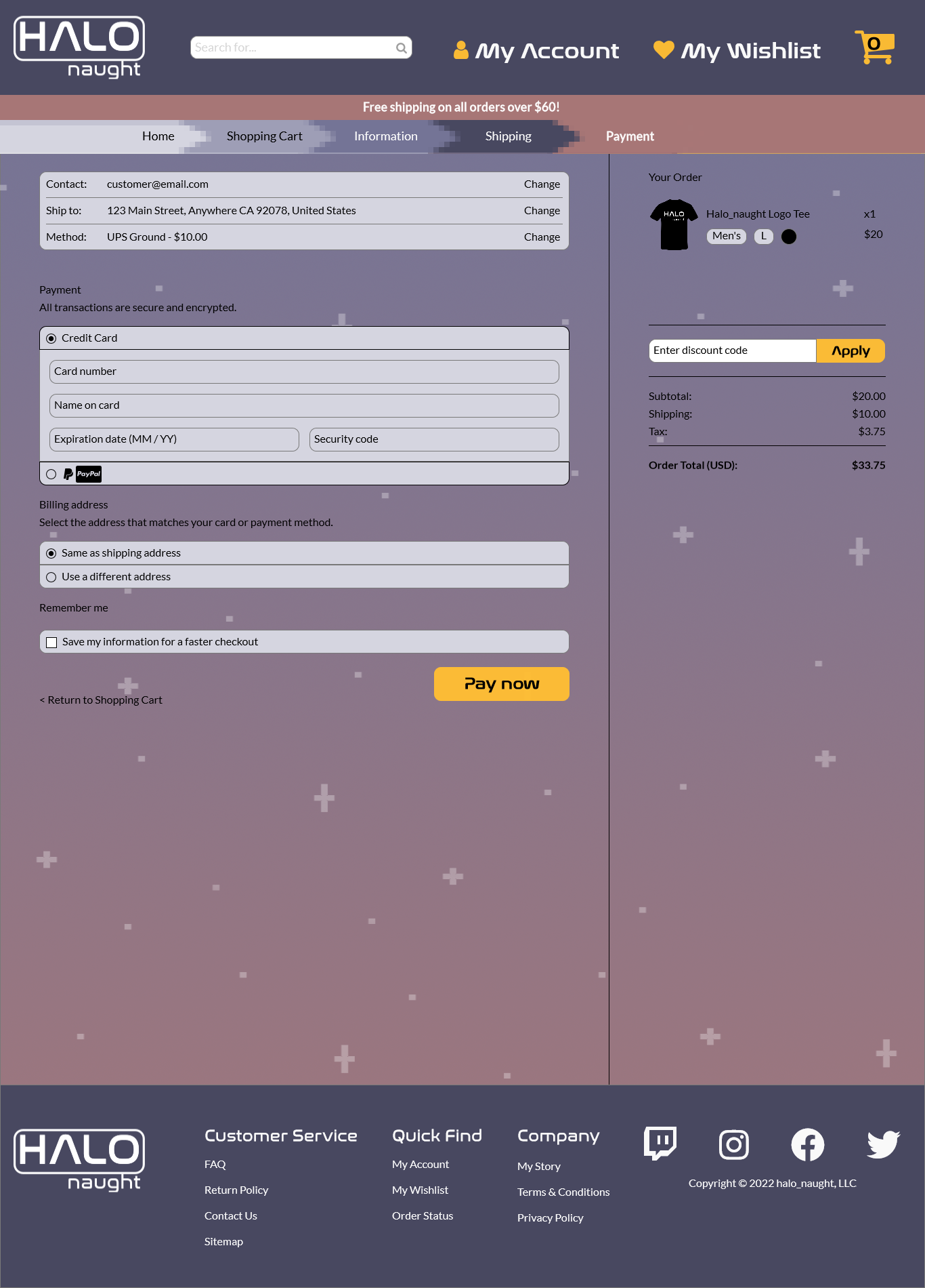
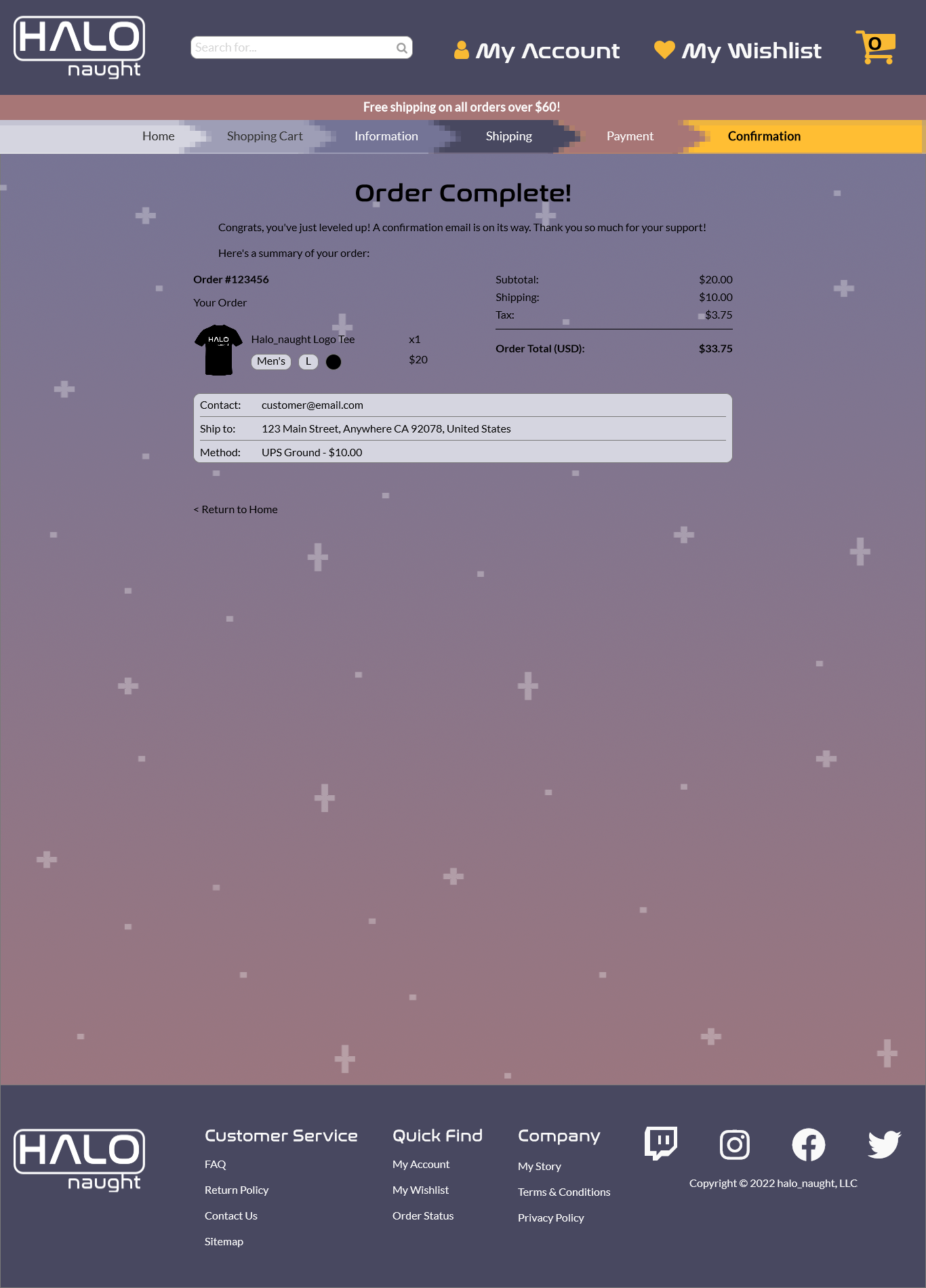
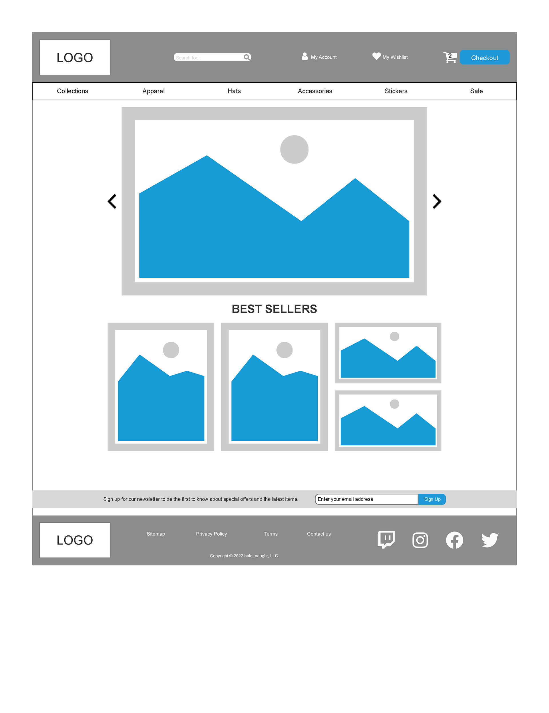
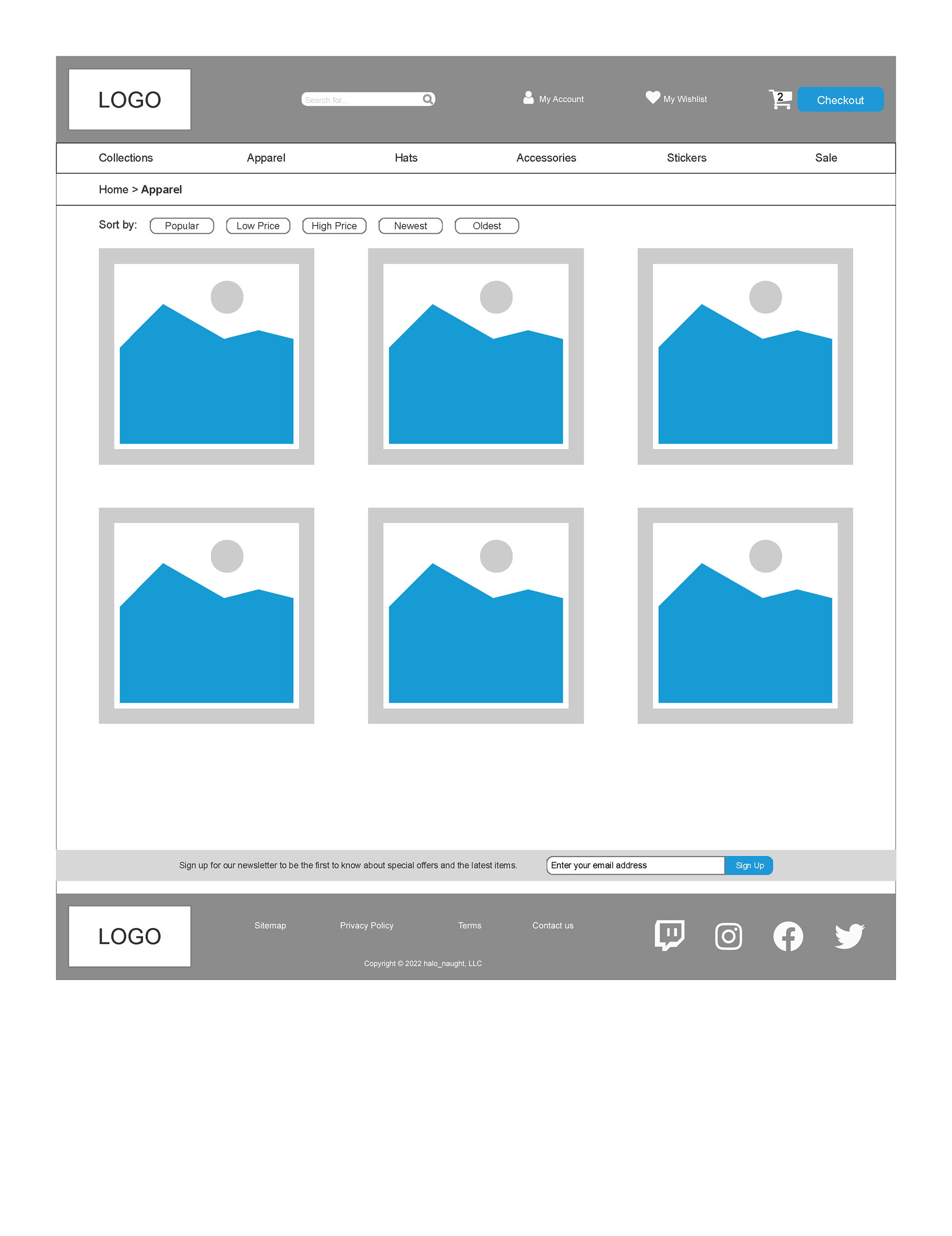
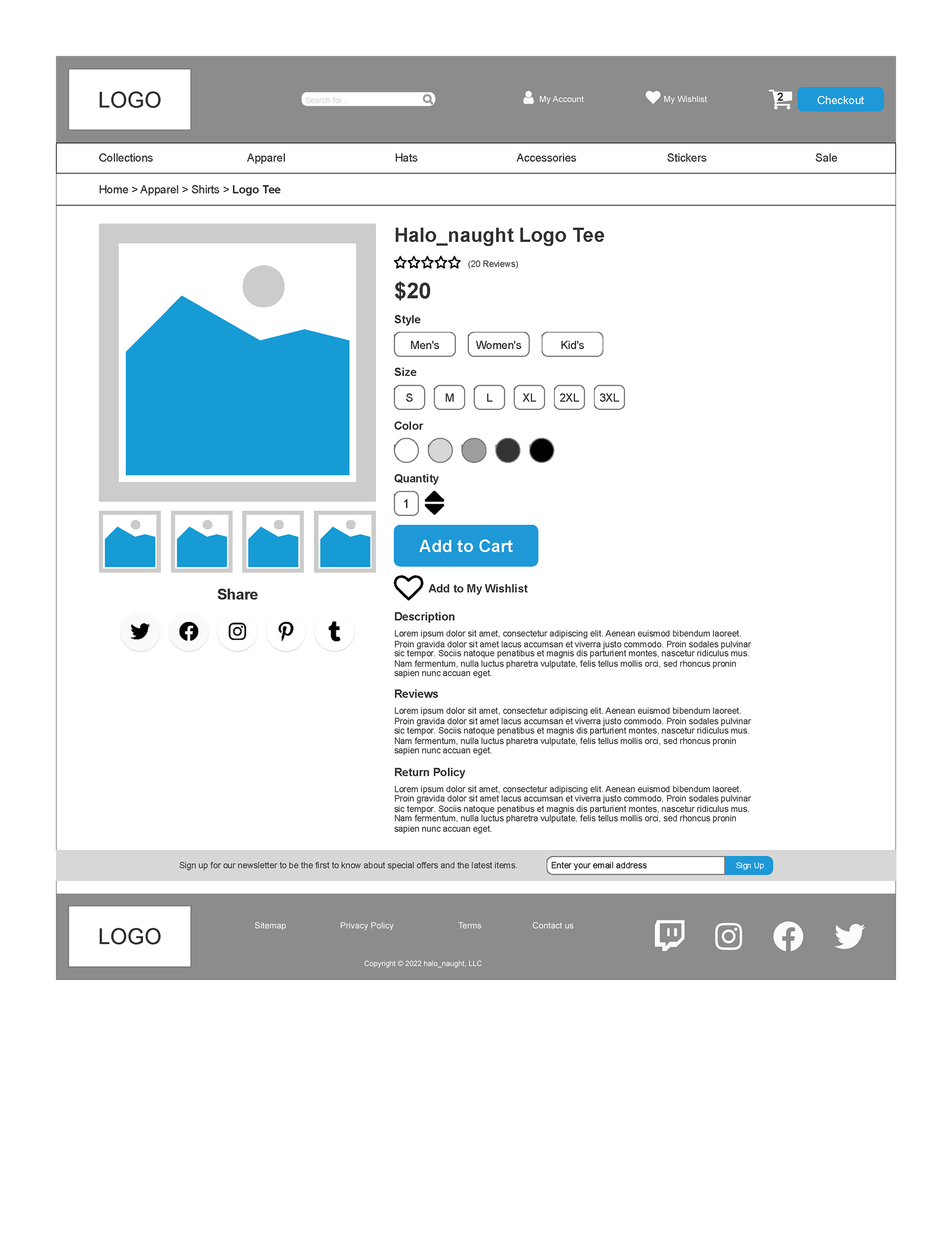
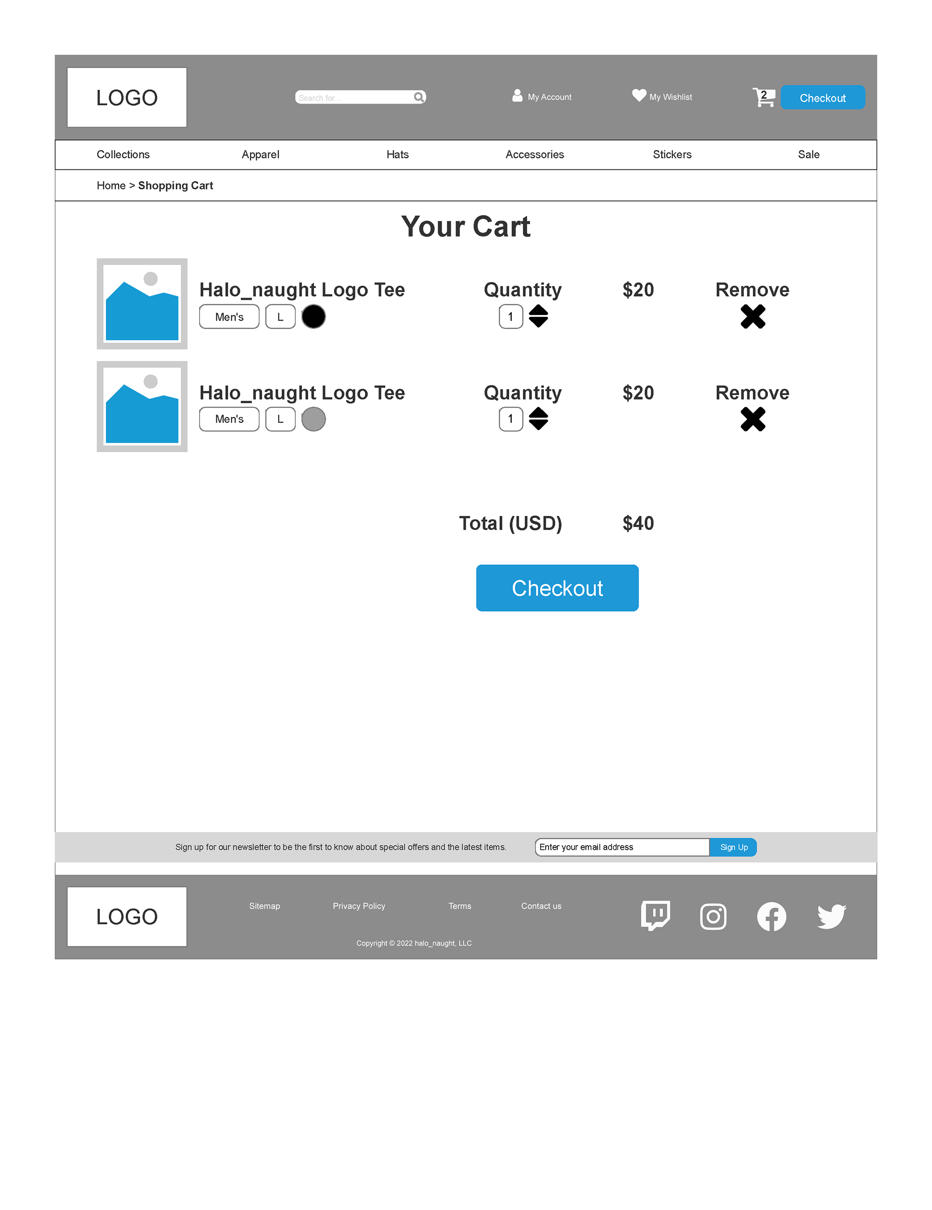
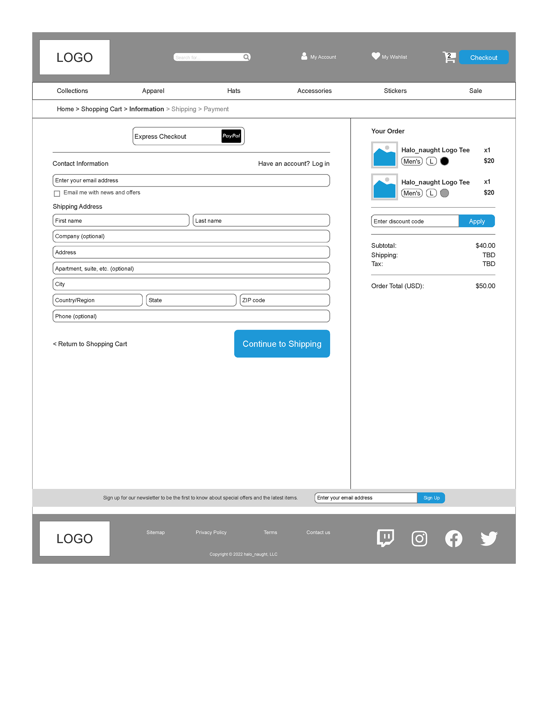
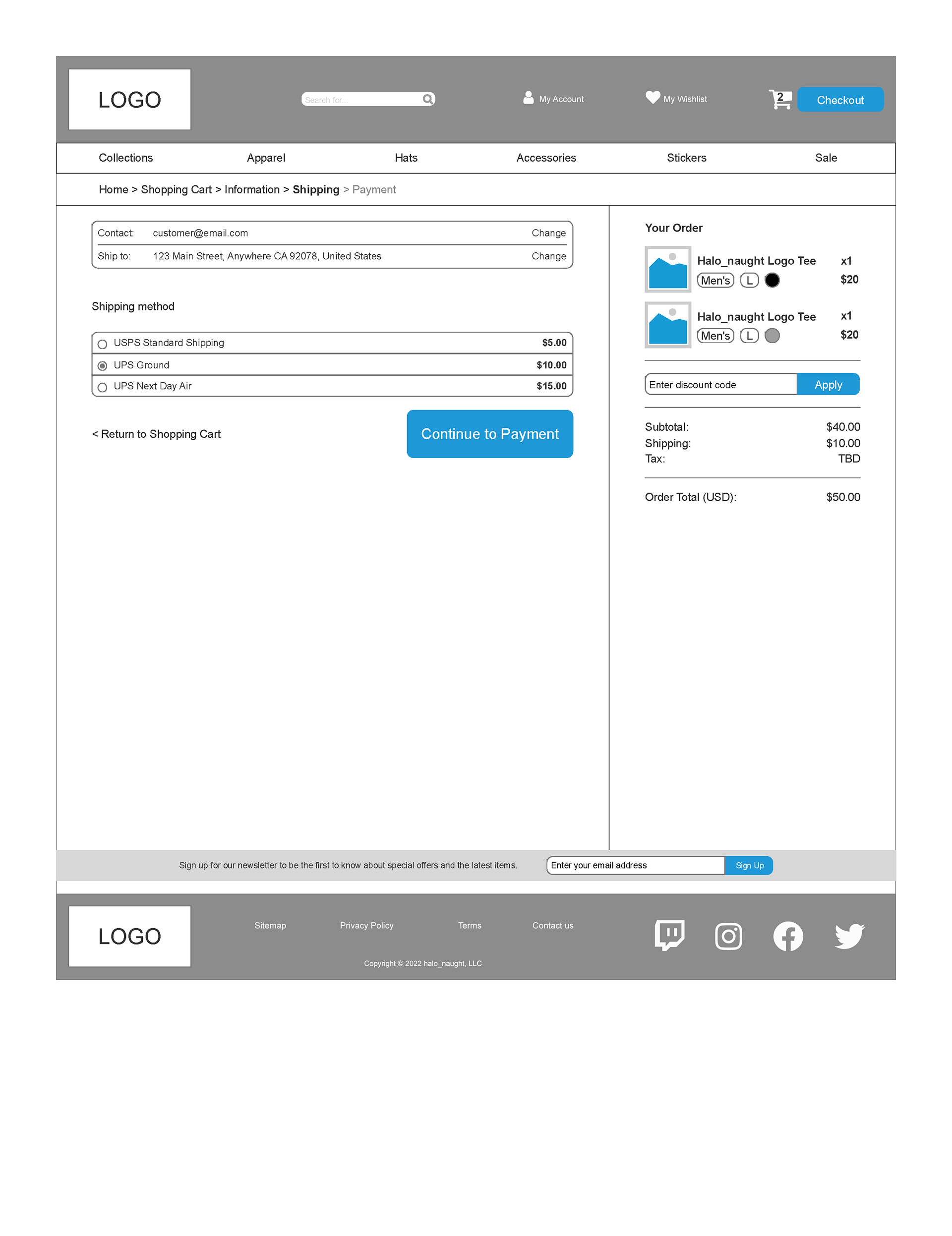
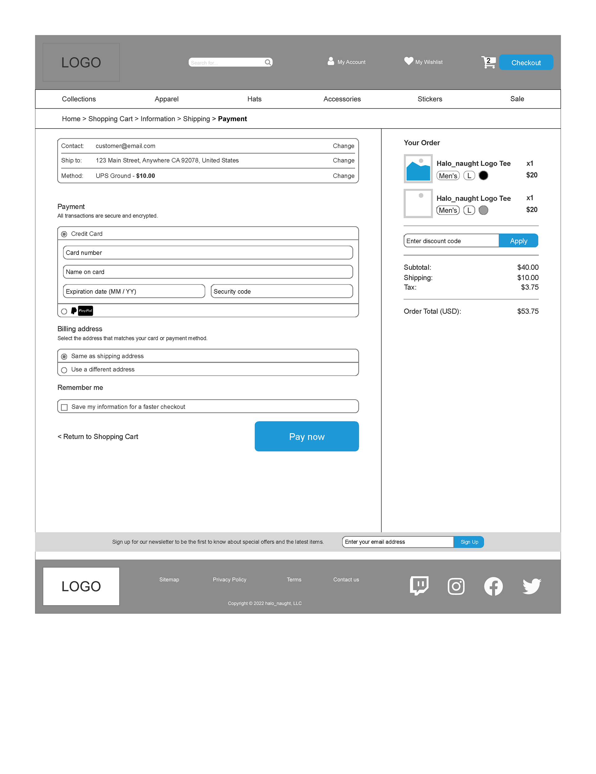
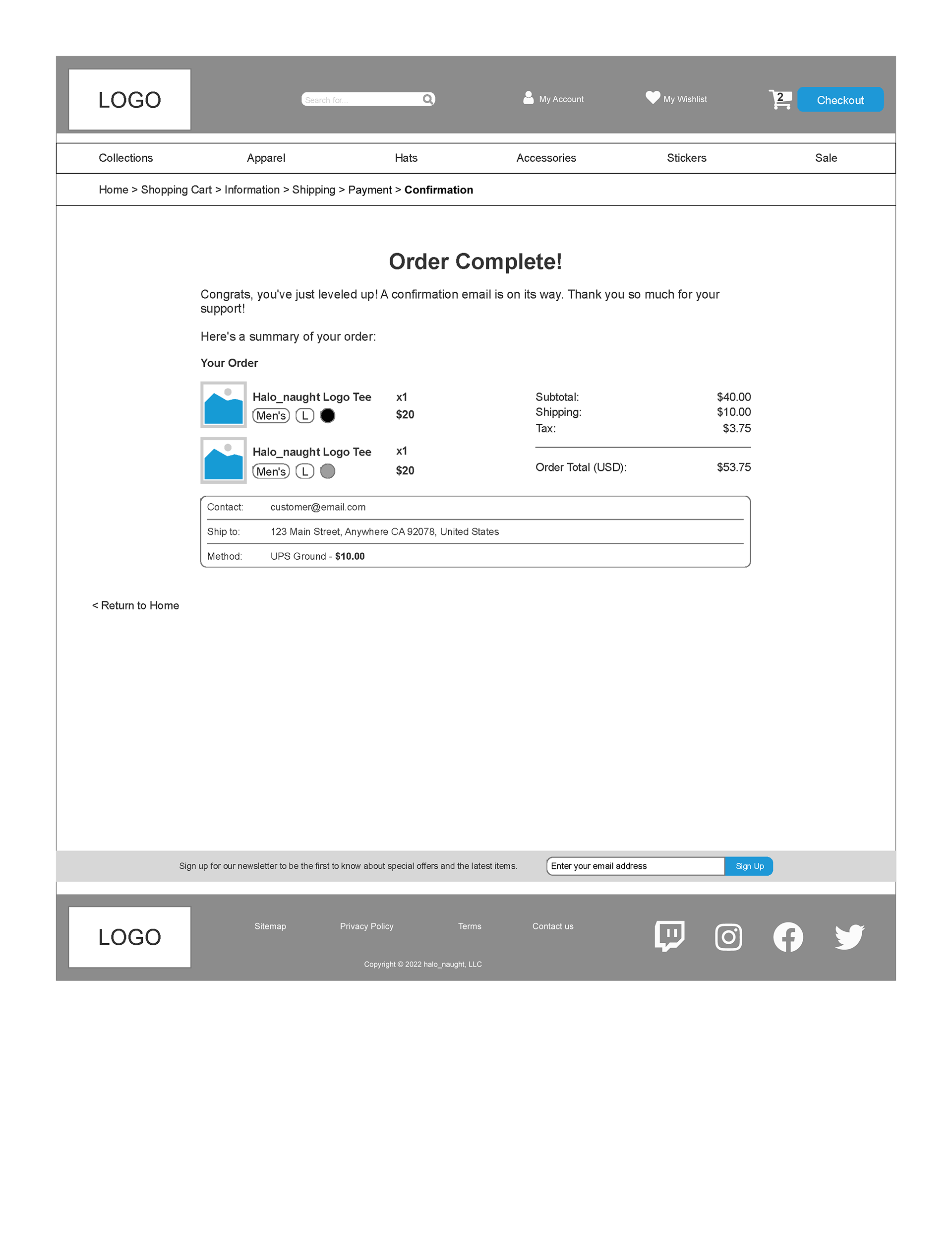
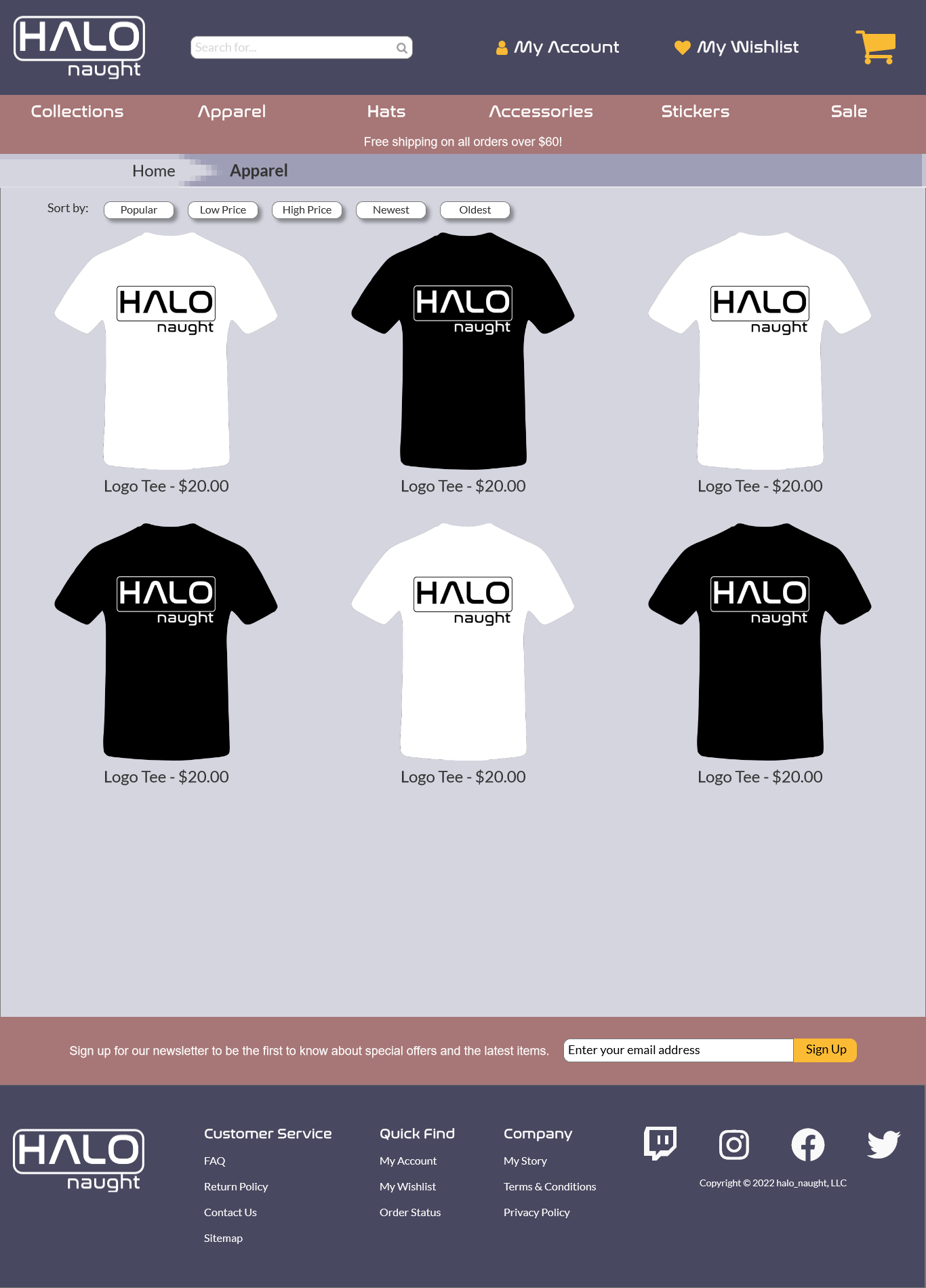
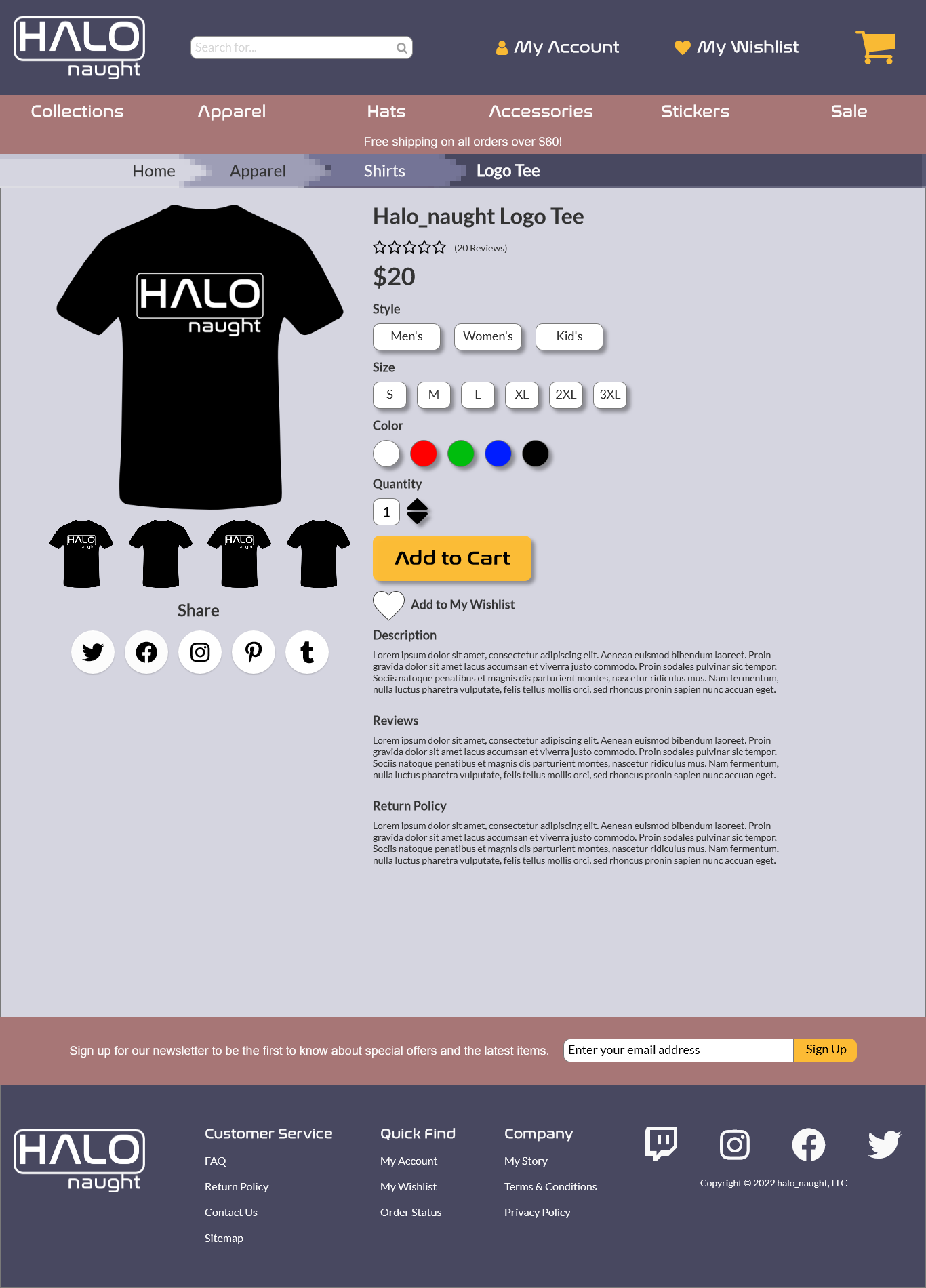
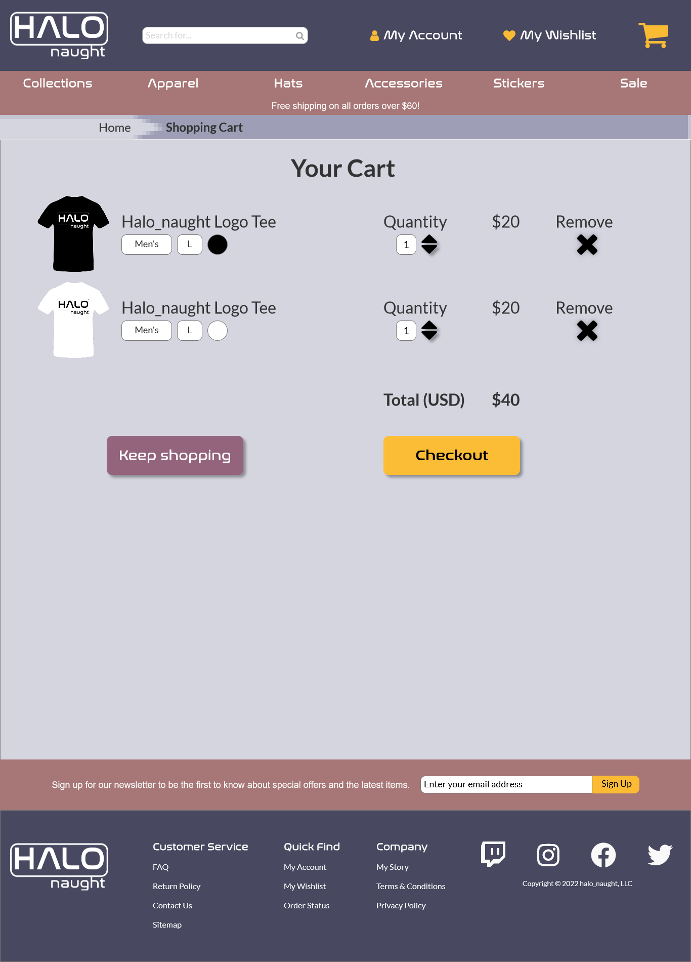
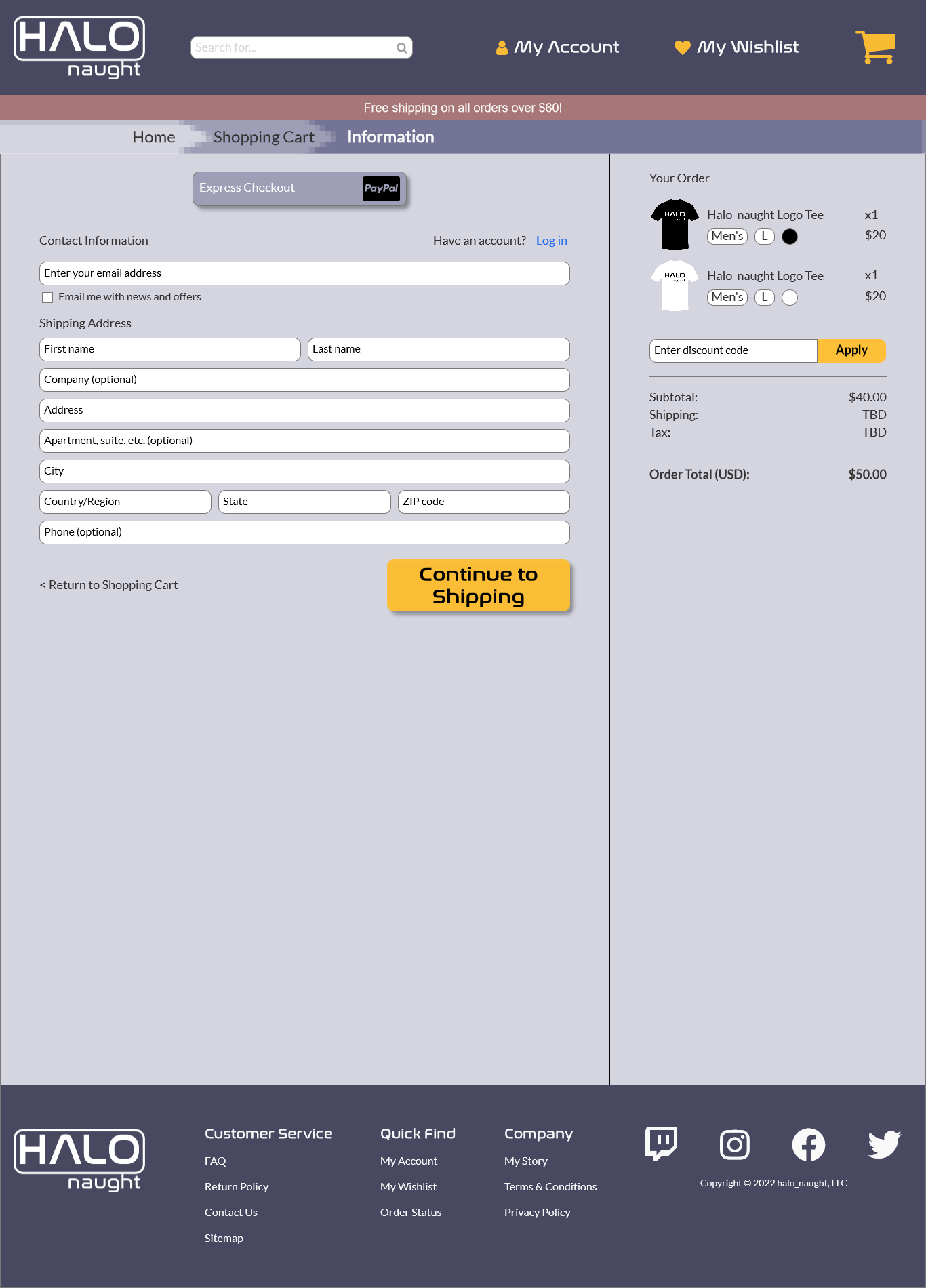
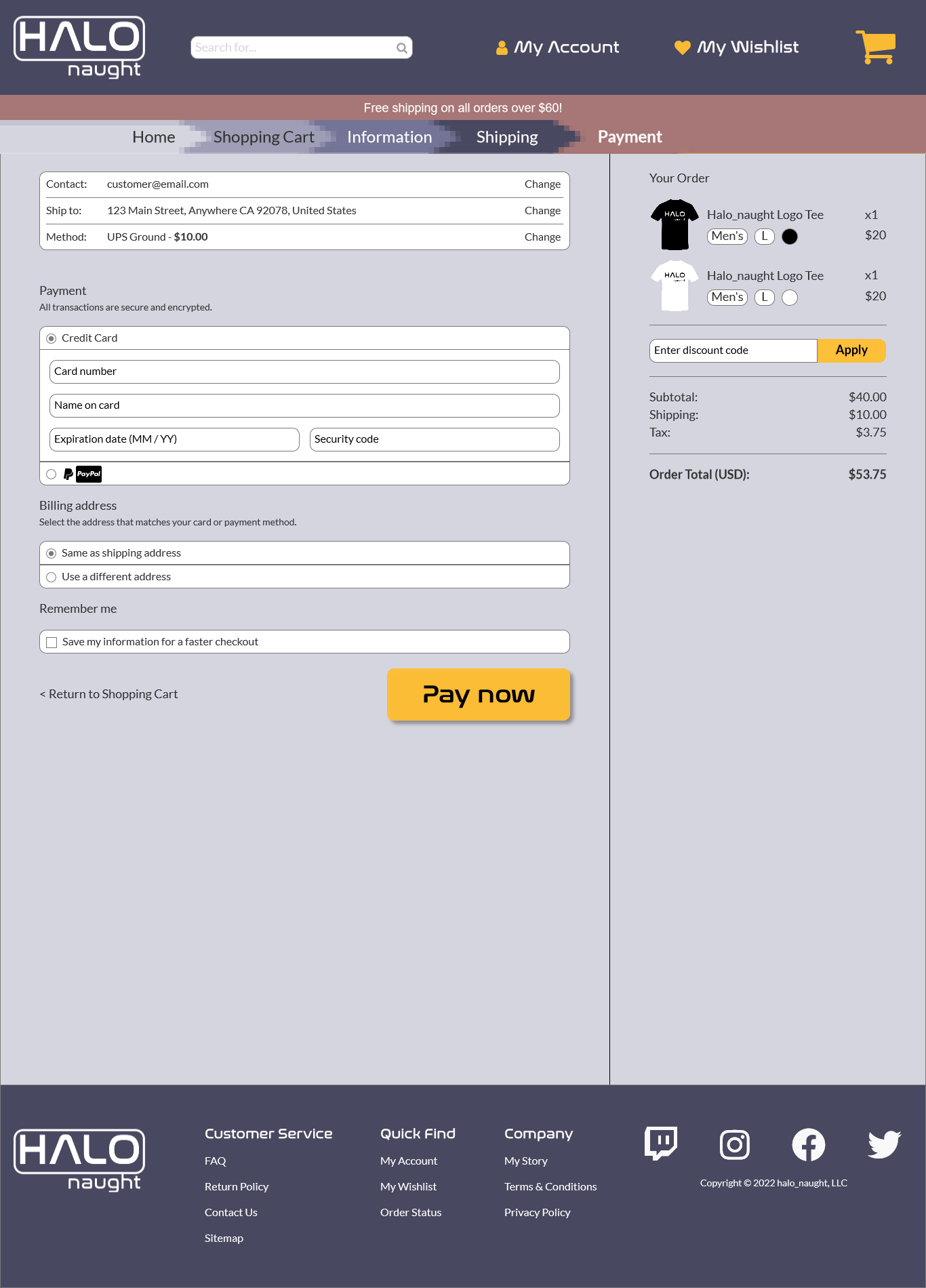
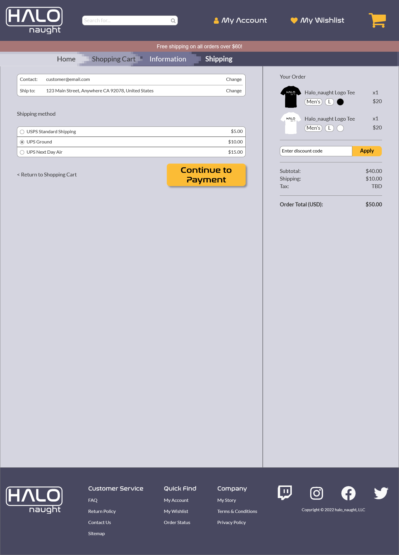
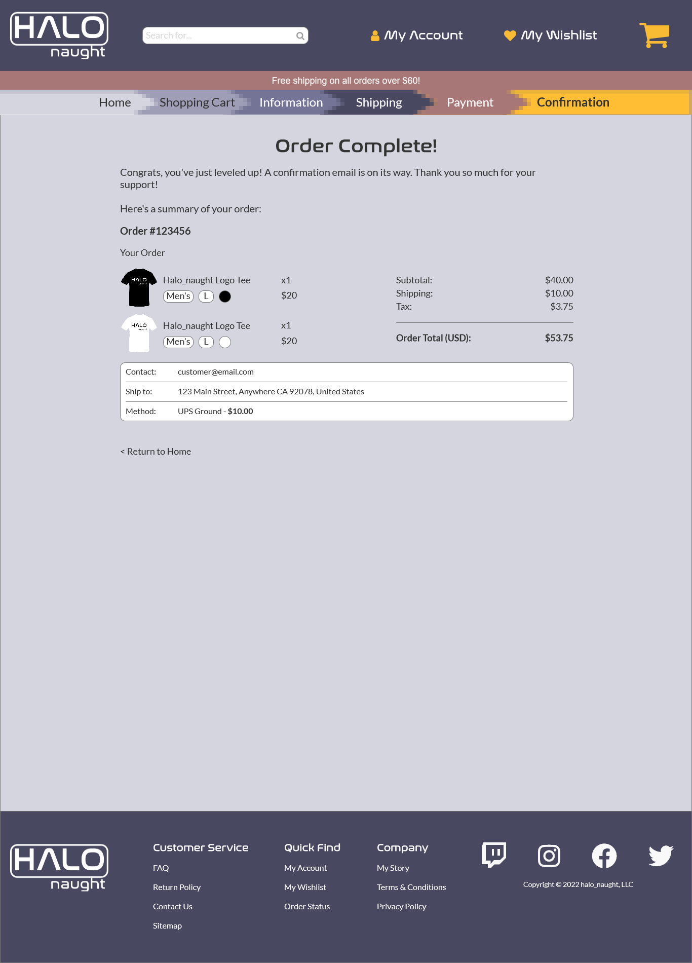
The primary goal of this site is to offer a fun, engaging, yet familiar ecommerce experience. Based on industry research, the site contains a category page, primary navigation bar, shopping cart functionality, a product page, and a 3-step checkout process. This was implemented into a wireframe to lay a solid foundation.
Prototype
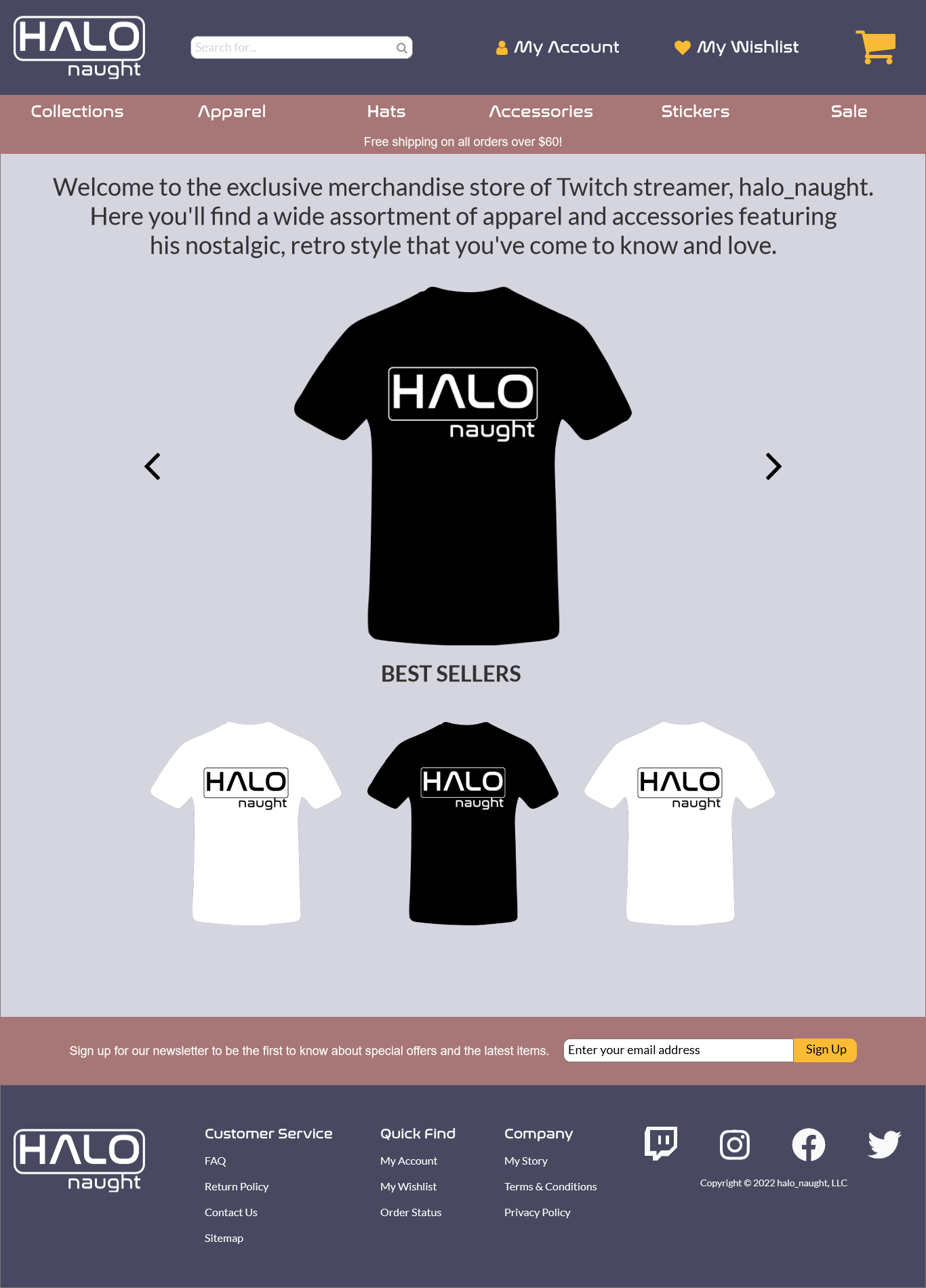
Analysis of the wireframe resulted in some changes in the header layout and sizing. The sizing of the product images was adjusted to be more consistent. A banner promoting free shipping was added. The footer contents were expanded. A more robust breadcrumb trail was added with a pixelated effect to tie into the theme.
3 - User Testing
User testing was conducted by sending a link to the prototype to all participants and asking them to perform 10 tasks over a video call. This was conducted with 5 participants that had never seen the prototype before. The tasks were chosen to simulate a standard ecommerce transaction where they would locate a product, add it to the cart, edit the cart, and complete the checkout process.
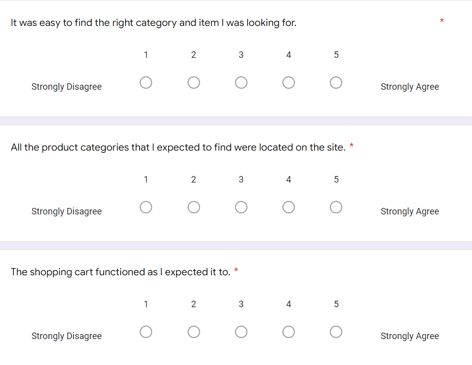
The participant's screen was shared so I could see what they did and I asked them to voice their thought process as they completed the tasks. Following the video call, I sent participants a questionnaire asking them how they felt about a variety of statements. These results were then analyzed to achieve insights about the prototype.
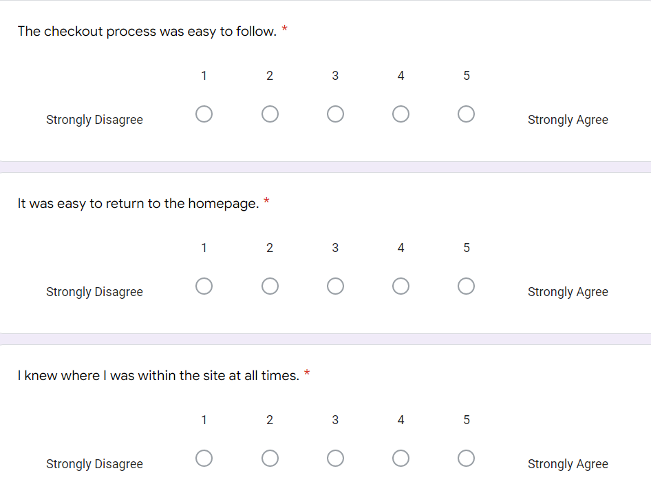
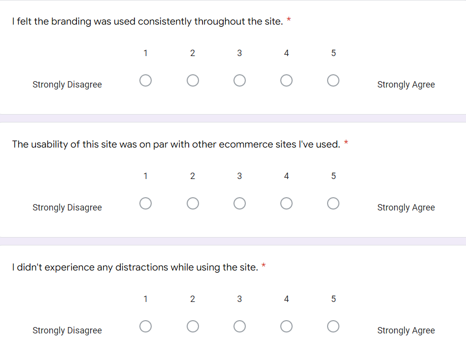
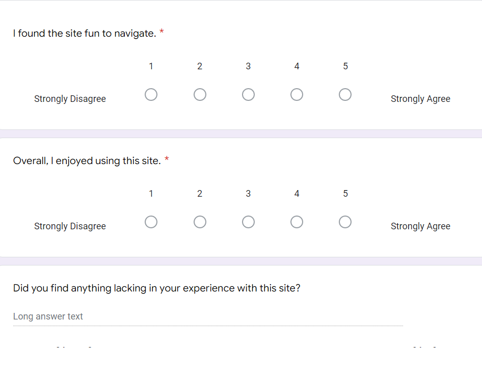
Analysis
After testing was completed, it was determined that overall the prototype performed as expected for an ecommerce site. There was a comment during testing regarding the functionality of the shopping cart not behaving as expected. I also asked them about a gradient background and analyzed that feedback.
Changes
Based on this feedback, I updated the cart functionality to perform as expected. I also lightened the background gradient to create higher contrast with the typography on some sections of the page.
4 - Final Design
The changes from user testing were made to the prototype. I added the background gradient and implemented a parallax feature that allows the "stars" to scroll at a different speed from the background. This tied into the "video game" theme and embodied what I had in mind when first visualizing the concept.
This was a fun project to work on as it took me from start to finish on this ecommerce site and working with a client. I had to learn a lot more about complex interactivity in Axure. The creation of a style guide was critical in planning the look and feel of the site and helping me to maintain the consistency throughout.
