Project Overview
Design a user interface for a fictional travel site that allows users to make reservations. The site must have all the standard features users have come to expect from modern travel sites.
Goal
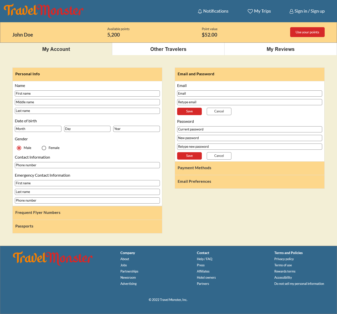
Using design patterns, design a UI that is familiar to users and has a unified and consistent look, feel, and flow. Users must be able to search, select their preferred flight, confirm the booking, and create an account.
Design Process
1 - Research
2 - Design
3 - Final Design
1 - Research
I began by researching other travel sites to see what design patterns are common and expected. Specifically, I looked at Expedia, Kayak, and Travelocity. I selected patterns which suited the needs of the users and the goals of the site. The primary user functions I identified are: search and browse (flights, hotels, etc.), complete a booking, and create an account to view bookings.
2 - Design
Wireframe
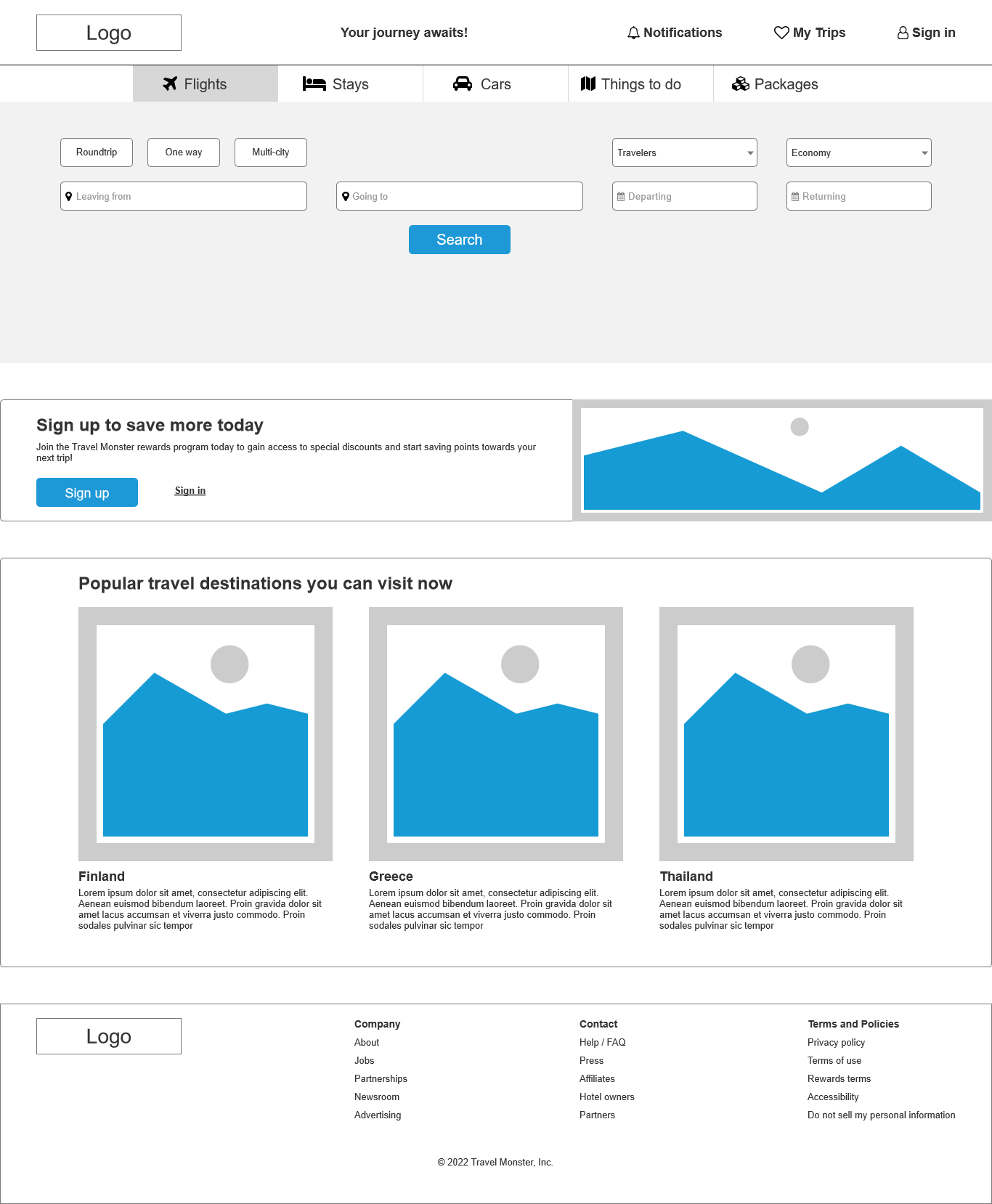
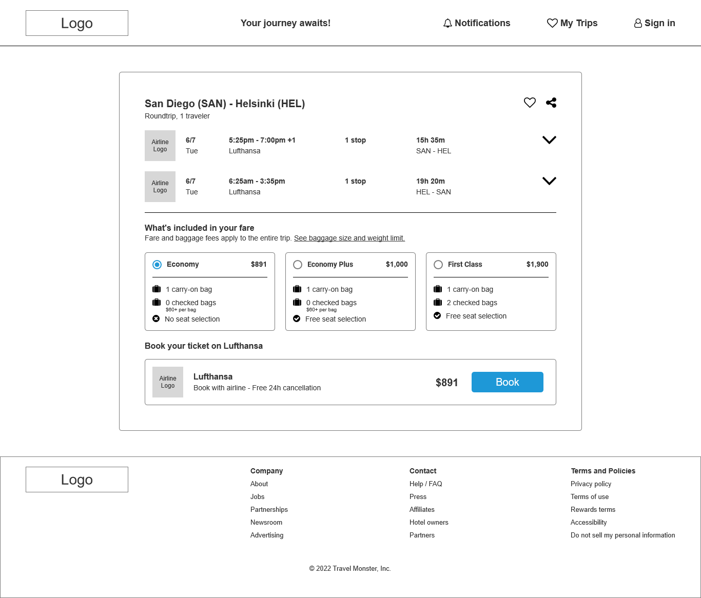
Based on the primary user functions, I decided to use the following primary patterns:
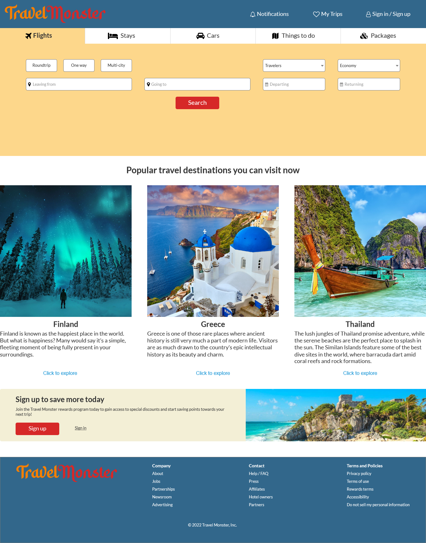
- Feature, search, and browse: The user needs a way to tell the site where they're going to and leaving from. Search fields on the home page accomplish this easily.
- Module tabs: Most travel sites have multiple offers for users. This includes flights, hotels, car rentals, activities, and packaged deals. Module tabs allow users to quickly switch between these offerings.
- Prominent call to action or assumed next step: Each page has a clear call to action differentiated by color to visually guide the user where to click to proceed.
- Sign in tools: Users will need a way to create an account to save their information for future use. It's commonly found in the header, and my UI design is no exception.
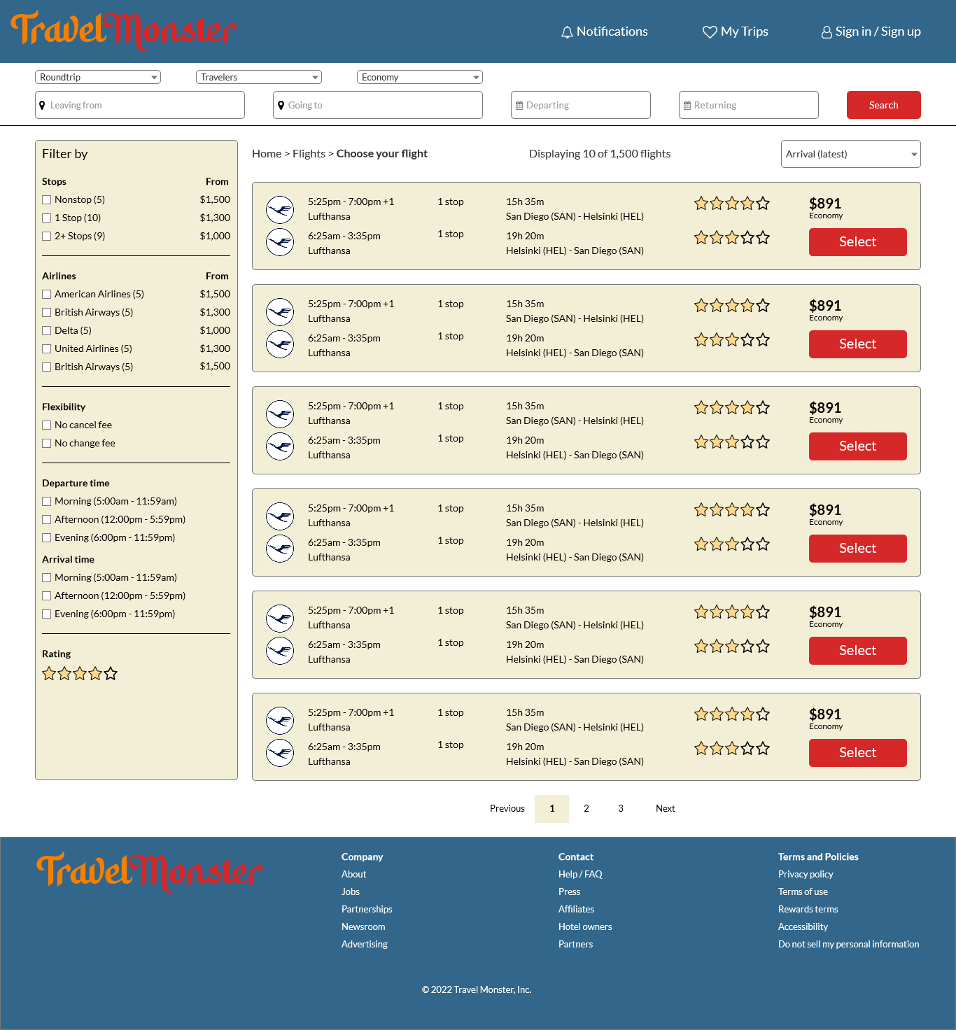
- Breadcrumbs: To prevent a user from getting lost on a page, breadcrumbs have been implemented to increase awareness and allow users to quickly go back a step or return to the home page.
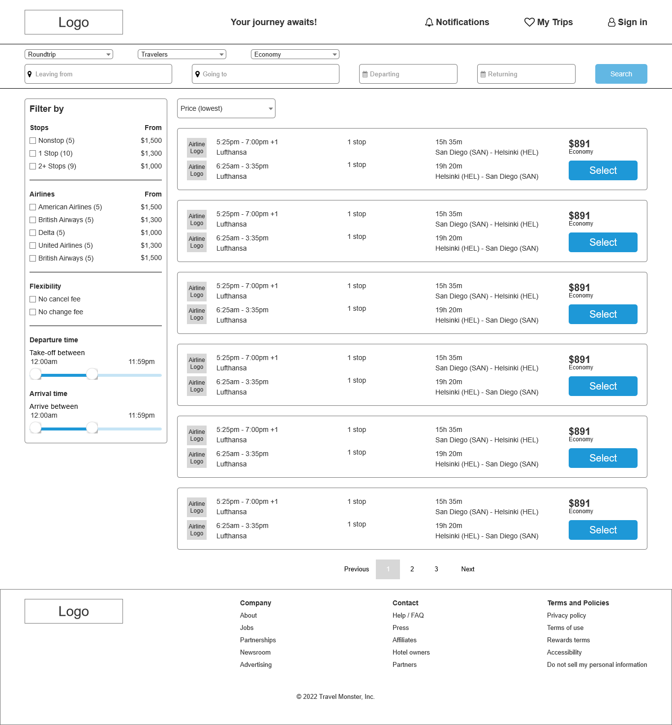
- Cards: Search results are displayed on cards to visually group the data. This groups all relevant information together in one place to allow users to quickly skim through them.
- Two-panel selector: On the search results page, the left panel contains a variety of filters to narrow the search results. The right panel contains the search results displayed on cards.

Mockup
In addition to adding images, typography, and a color palette, some minor tweaks were made after reviewing the wireframe. The module tabs on the home page were expanded to reach the edge of the page. On the search results page, the number of results and a breadcrumb trail was added near the top.
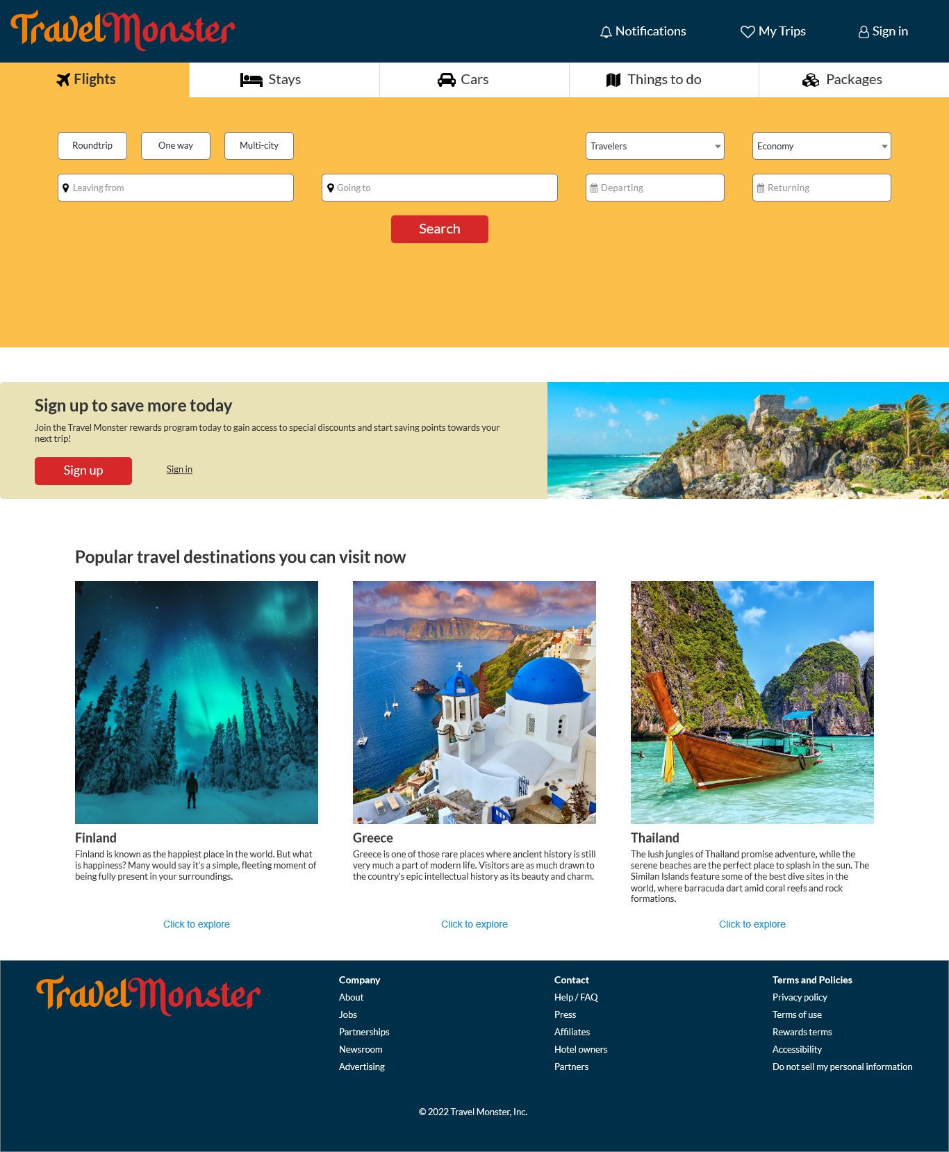
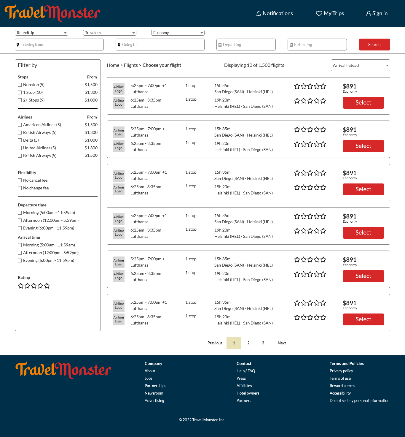
3 - Final Design
Analysis of the mockup led to additional changes to the UI design. On the home page, the popular travel destinations were moved up the page and their imagers were made larger to increase visibility to the user. The color palette was lightened up to allow the popular travel destinations section to draw the user's eye first followed by the module tabs. Missing logos were added to complete the look. Colors were added to the search results to visually group the page into sections. The final lacks some basic interactivity as the purpose of the project was the UI itself.
